Chapter 7 Encoding Behavioral Data
Behavioral data comes in many different flavors and shapes. Data stored in databases also have different structures (relational, graph, plain text, etc.). As mentioned in chapter 1, before training a predictive model, data goes through a series of steps, from data collection to preprocessing (Figure 1.7). During those steps, data is transformed and shaped with the aim of easing the operations in the subsequent tasks. Finally, the data needs to be encoded in a very specific format as expected by the predictive model. For example, decision trees and many other classifier methods expect their input data to be formatted as feature vectors while Dynamic Time Warping expects the data to be represented as timeseries. Images are usually encoded as \(n\)-dimensional matrices. When it comes to social network analysis, a graph is the preferred representation.
So far, I have been mentioning two key terms: encode and representation. The Cambridge Dictionary15 defines the verb encode as:
“To put information into a form in which it can be stored, and which can only be read using special technology or knowledge…”.
while TechTerms.com16 defines it as:
“Encoding is the process of converting data from one form to another”.
Both definitions are similar, but in this chapter’s context, the second one makes more sense. The Cambridge Dictionary17 defines representation as:
“The way that someone or something is shown or described”.
TechTerms.com returned no results for that word. From now on, I will use the term encode to refer to the process of transforming the data and representation as the way data is ‘conceptually’ described. Note the ‘conceptually’ part which means the way we humans think about it. This means that data can have a conceptual representation but that does not necessarily mean it is digitally stored in that way. For example, a physical activity like walking captured with a motion sensor can be conceptually represented by humans as a feature vector but its actual digital format inside a computer is binary (see Figure 7.1).
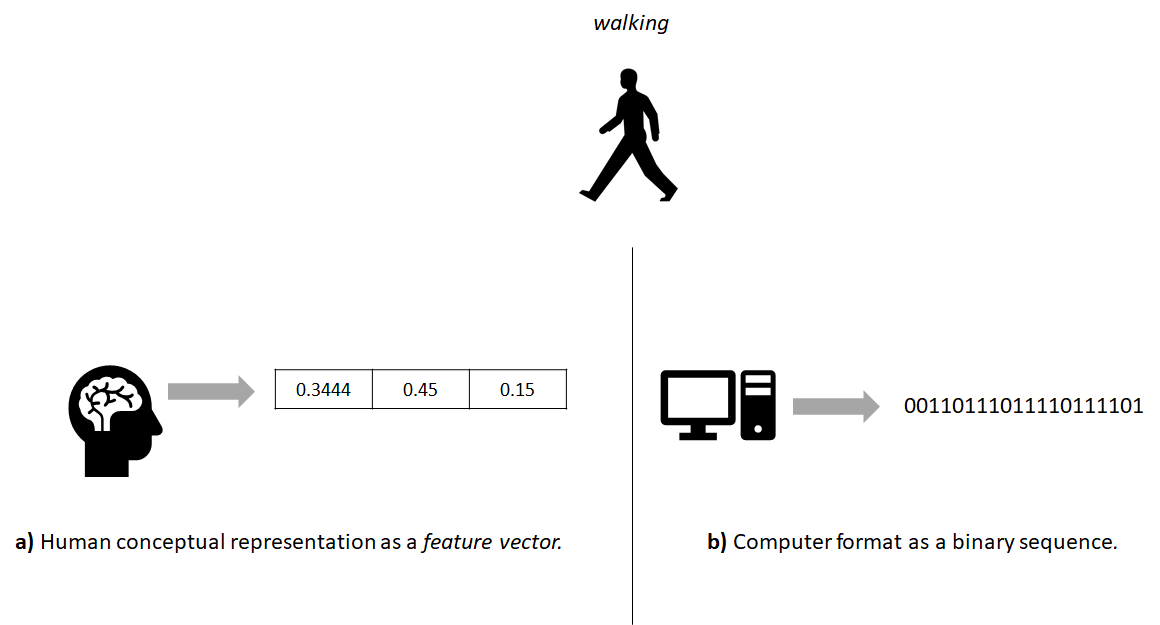
FIGURE 7.1: The real world walking activity as a) human conceptual representation and b) computer format.
It is also possible to encode the same data into different representations (see Figure 7.2 for an example) depending on the application or the predictive model to be used. Each representation has its own advantages and limitations (discussed in the following subsections) and they capture different aspects of the real-world phenomenon. Sometimes it is useful to encode the same data into different representations so more information can be extracted and complemented as discussed in section 3.4. In the next sections, several types of representations will be presented along with some ideas of how the same raw data can be encoded into different ones.
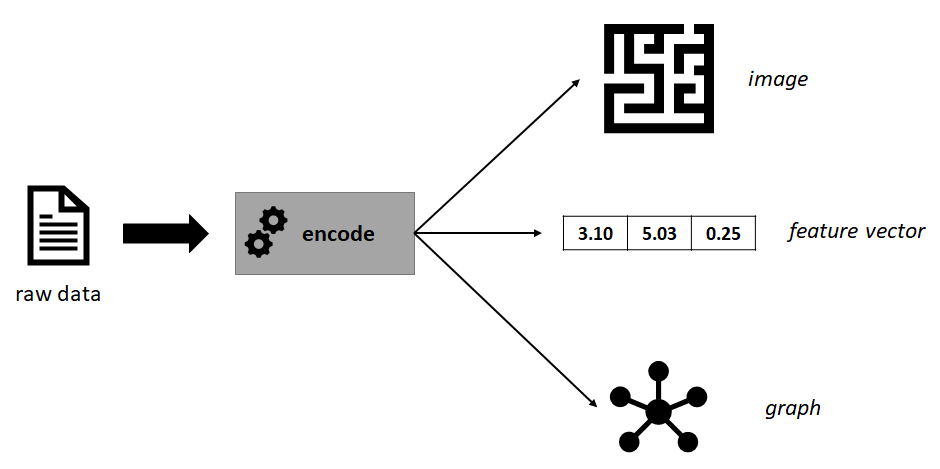
FIGURE 7.2: Example of some raw data encoded into different representations.
7.1 Feature Vectors
From previous chapters, we have already seen how data can be represented as feature vectors. For example, when classifying physical activities (section 2.3.1) or clustering questionnaire answers (section 6.1.1). Feature vectors are compact representations of real-world phenomena or objects and usually, they are modeled in a computer as numeric arrays. Most machine learning algorithms work with feature vectors. Generating feature vectors requires knowledge of the application domain. Ideally, the feature vectors should represent the real-world situation as accurately as possible. We could achieve a good mapping by having feature vectors of infinite size, unfortunately, that is infeasible. In practice, small feature vectors are desired because that reduces storage requirements and computational time.
The process of designing and extracting feature vectors from raw data is known as feature engineering. This also involves the process of deciding which features to extract. This requires domain knowledge as the features should capture the information needed to solve the problem. Suppose we want to classify if a person is ‘tired’ or ‘not tired’. We have access to some details about the person like age, height, the activities performed during the last \(30\) minutes, and so on. For simplicity, let’s assume we can generate feature vectors of size \(2\) and we have two options:
Option 1. Feature vectors where the first element is age and the second element is height.
Option 2. Feature vectors where the first element is the number of squats done by the user during the last \(30\) minutes and the second element is heart rate.
Clearly, for this specific classification problem the second option is more likely to produce better results. The first option may not even contain enough information and will lead the predictive model to produce random predictions. With the second option, the boundaries between classes are more clear (see Figure 7.3) and classifiers will have an easier time finding them.
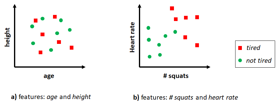
FIGURE 7.3: Two different feature vectors for classifying tired and not tired.
In R, feature vectors are stored as data frames where rows are individual instances and columns are features. Some of the advantages and limitations of feature vectors are listed below.
Advantages:
- Efficient in terms of memory.
- Most machine learning algorithms support them.
- Efficient in terms of computations compared to other representations.
Limitations:
- Are static in the sense that they cannot capture temporal relationships.
- A lot of information and/or temporal relationships may be lost.
- Some features may be redundant leading to decreased performance.
- It requires effort and domain knowledge to extract them.
- They are difficult to plot if the dimension is \(> 2\) unless some dimensionality reduction method is applied such as Multidimensional Scaling (chapter 4).
7.2 Timeseries
A timeseries is a sequence of data points ordered in time. We have already worked with timeseries data in previous chapters when classifying physical activities and hand gestures (chapter 2). Timeseries can be multi-dimensional. For example, typical inertial sensors capture motion forces in three axes. Timeseries analysis methods can be used to find underlying time-dependent patterns while timeseries forecasting methods aim to predict future data points based on historical data. Timeseries analysis is a very extensive topic and there are a number of books on the topic. For example, the book “Forecasting: Principles and Practice” by Hyndman and Athanasopoulos (2018) focuses on timeseries forecasting with R.
In this book we mainly use timeseries data collected from sensors in the context of behavior predictions using machine learning. We have already seen how classification models (like decision trees) can be trained with timeseries converted into feature vectors (section 2.3.1) or by using the raw timeseries data with Dynamic Time Warping (section 2.5.1).
Advantages:
- Many problems have this form and can be naturally modeled as timeseries.
- Temporal information is preserved.
- Easy to plot and visualize.
Limitations:
- Not all algorithms support timeseries of varying lengths so, one needs to truncate and/or do some type of padding.
- Many timeseries algorithms are slower than the ones that work with feature vectors.
- Timeseries can be very long, thus, making computations very slow.
7.3 Transactions
Sometimes we may want to represent data as transactions, as we did in section 6.3. Data represented as transactions are usually intended to be used by association rule mining algorithms (see section 6.3). As a minimum, a transaction has a unique identifier and a set of items. Items can be types of products, symptoms, ingredients, etc. A set of transactions is called a database. Figure 7.4 taken from chapter 6 shows an example database with \(10\) transactions. In this example, items are sets of products from a supermarket.
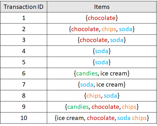
FIGURE 7.4: Example database with 10 transactions.
Transactions can include additional information like customer id, date, total cost, etc. Transactions can be coded as logical matrices where rows represent transactions and columns represent items. A TRUE value indicates that the particular item is present and FALSE indicates that the particular item is not part of that set. When the number of possible items is huge and item sets contain a small number of items, this type of matrix can be memory-inefficient. This is called a sparse matrix, that is, a matrix where many of its entries are FALSE (or empty, in general). Transactions can also be stored as lists or in a relational database such as MySQL. Below are some advantages of representing data as transactions.
Advantages:
Association rule mining algorithms such as Apriori can be used to extract interesting behavior relationships.
Recommendation systems can be built based on transactional data.
Limitations:
- Can be inefficient to store them as a logical matrices.
- There is no order associated with the items or temporal information.
7.4 Images
timeseries_to_images.R plot_activity_images.R
Images are rich visual representations that capture a lot of information –including spatial relationships. Pictures taken from a camera, drawings, scanned documents, etc., already are examples of images. However, other types of non-image data can be converted into images. One of the main advantages of analyzing images is that they retain spatial information (distance between pixels). This information is useful when using predictive models that take advantage of those properties such as Convolutional Neural Networks (CNNs) which will be presented in chapter 8. CNNs have proven to produce state of the art results in many vision-based tasks and are very flexible models in the sense that they can be adapted for a variety of applications with little effort.
Before CNNs were introduced by Lecun (LeCun et al. 1998), image classification used to be feature-based. One first needed to extract hand-crafted features from images and then use a classifier to make predictions. Also, images can be flattened into one-dimensional arrays where each element represents a pixel (Figure 7.5). Then, those \(1\)D arrays can be used as feature vectors to perform training and inference.
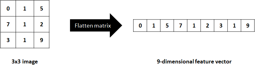
FIGURE 7.5: Flattening a matrix into a 1D array.
Flattening an image can lead to information loss and the dimension of the resulting vector can be very high, sometimes limiting its applicability and/or performance. Feature extraction from images can also be a complicated task and is very application dependent. CNNs have changed that. They take as input raw images, that is, matrices and automatically extract features and perform classification or regression.
What if the data are not represented as images but we still want to take advantage of featureless models like CNNs? Depending on the type of data, it may be possible to encode it as an image. For example, timeseries data can be encoded as an image. In fact, a timeseries can already be considered an image with a height of \(1\) but they can also be reshaped into square matrices.
Take for example the SMARTPHONE ACTIVITIES dataset which contains accelerometer data for each of the \(x\), \(y\), and \(z\) axes. The script timeseries_to_images.R shows how the acceleration timeseries can be converted to images. A window size of \(100\) is defined. Since the sampling rate was \(20\) Hz, each window corresponds to \(100/20 = 5\) seconds. For each window, we have \(3\) timeseries (\(x\),\(y\),\(z\)). We can reshape each of them into \(10 \times 10\) matrices by arranging the elements into columns. Then, the three matrices can be stacked to form a \(3\)D image similar to an RGB image. Figure 7.6 shows the process of reshaping \(3\) timeseries of size \(9\) into \(3 \times 3\) matrices to generate an RGB-like image.
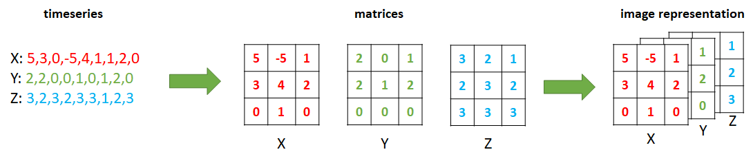
FIGURE 7.6: Encoding 3 accelerometer timeseries as an image.
The script then moves to the next window with no overlap and repeats the process. Actually, the script saves each image as one line of text. The first \(100\) elements correspond to the \(x\) axis, the next \(100\) to \(y\), and the remaining to \(z\). Thus each line has \(300\) values. Finally, the user id and the corresponding activity label are added at the end. This format will make it easy to read the file and reconstruct the images later on. The resulting file is called images.txt and is already included in the smartphone_activities dataset folder.
The script plot_activity_images.R shows how to read the images.txt file and reconstruct the images so we can plot them. Figure 7.7 shows three different activities plotted as colored images of \(10 \times 10\) pixels. Before generating the plots, the images were normalized between \(0\) and \(1\).
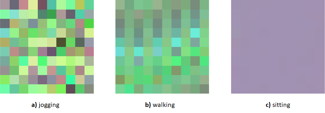
FIGURE 7.7: Three activities captured with an accelerometer represented as images.
We can see that the patterns for ‘jogging’ look more “chaotic” compared to the others while the ‘sitting’ activity looks like a plain solid square. Then, we can use those images to train a CNN and perform inference. CNNs will be covered in chapter 8 and used to build adaptive models using these activity images.
Advantages:
- Spatial relationships can be captured.
- Can be multi-dimensional. For example \(3\)D RGB images.
- Can be efficiently processed with CNNs.
Limitations:
- Computational time can be higher than when processing feature vectors. Still, modern hardware and methods allow us to perform operations very efficiently.
- It can take some extra processing to convert non-image data into images.
7.5 Recurrence Plots
Recurrence plots (RPs) are visual representations similar to images but typically they only have one dimension (depth). They are encoded as \(n \times n\) matrices, that is, the same number of rows and columns (a square matrix). Even though these are like a special case of images, I thought it would be worth having them in their own subsection! Just as with images, timeseries can be converted into RPs and then used to train a CNN.
A RP is a visual representation of time patterns of dynamical systems (for example, timeseries). RPs were introduced by Eckmann, Kamphorst, and Ruelle (1987) and they depict all the times when a trajectory is roughly in the same state. They are visual representations of the dynamics of a system. Biological systems possess behavioral patterns and activity dynamics that can be captured with RPs, for example, the dynamics of ant colonies (Neves 2017).
At this point, you may be curious about how a RP looks like. So let me begin by showing a picture18 of \(4\) time series with their respective RP (Figure 7.8).
![Four timeseries (top) with their respective RPs (bottom). (Author: Norbert Marwan/Pucicu at German Wikipedia. Source: Wikipedia (CC BY-SA 3.0) [https://creativecommons.org/licenses/by-sa/3.0/legalcode]).](images/RP_examples.png)
FIGURE 7.8: Four timeseries (top) with their respective RPs (bottom). (Author: Norbert Marwan/Pucicu at German Wikipedia. Source: Wikipedia (CC BY-SA 3.0) [https://creativecommons.org/licenses/by-sa/3.0/legalcode]).
The first RP (leftmost) does not seem to have a clear pattern (white noise) whereas the other three show some patterns like diagonals of different sizes, some square and circular shapes, and so on. RPs can be characterized by small-scale and large-scale patterns. Examples of small-scale patterns are diagonals, horizontal/vertical lines, dots, etc. Large-scale patterns are called typology and they depict the global characteristics of the dynamic system 19.
The visual interpretation of RPs requires some experience and is out of the scope of this book. However, they can be used as a visual pattern extraction tool to represent the data and then, in conjunction with machine learning methods like CNNs, used to solve classification problems.
But how are RPs computed? Well, that is the topic of the next section.
7.5.1 Computing Recurrence Plots
It’s time to delve into the details about how these mysterious plots are computed. Suppose there is a timeseries with \(n\) elements (points). To compute its RP we need to compute the distance between each pair of points. We can store this information in a \(n \times n\) matrix. Let’s call this a distance matrix \(D\). Then, we need to define a threshold \(\epsilon\). For each entry in \(D\), if the distance is less or equal than the threshold \(\epsilon\), it is set to \(1\) and \(0\) otherwise.
Formally, a recurrence of a state at time \(i\) at a different time \(j\) is marked within a two-dimensional squared matrix with ones and zeros where both axes represent time:
\[\begin{equation} R_{i,j} \left( x \right) = \begin{cases} 1 & \textbf{if } \lvert\lvert \vec{x}_i - \vec{x}_j \rvert \rvert \leq \epsilon \\ 0 & \textbf{otherwise}, \end{cases} \tag{7.1} \end{equation}\]
where \(\vec{x}\) are the states and \(\lvert\lvert \cdot \rvert \rvert\) is a norm (for example Euclidean distance). \(R_{i,j}\) is the square matrix and will be \(1\) if \(\vec{x}_i \approx \vec{x}_j\) up to an error \(\epsilon\). The \(\epsilon\) is important since systems often do not recur exactly to a previously visited state.
The threshold \(\epsilon\) needs to be set manually which can be difficult in some situations. If not set properly, the RP can end up having excessive ones or zeros. If you plan to use RPs as part of an automated process and fed them to a classifier, you can use the distance matrix instead. The advantage is that you don’t need to specify any parameter except for the distance function. The distance matrix can be defined as:
\[\begin{equation} \label{eq:distance_matrix} D_{i,j} \left( x \right) = \lvert\lvert \vec{x}_i - \vec{x}_j \rvert \rvert \end{equation}\]
which is similar to Equation (7.1) but without the extra step of applying a threshold.
Advantages:
- RPs capture dynamic patterns of a system.
- They can be used to extract small and large scale patterns.
- Timeseries can be easily encoded as RPs.
- Can be used as input to CNNs for supervised learning tasks.
Limitations:
- Computationally intensive since all pairs of distances need to be calculated.
- Their visual interpretation requires experience.
- A threshold needs to be defined and it is not always easy to find the correct value. However, the distance matrix can be used instead.
7.5.2 Recurrence Plots of Hand Gestures
recurrence_plots.R
In this section, I am going to show you how to compute recurrence plots in R using the HAND GESTURES dataset. The code can be found in the script recurrence_plots.R. First, we need a norm (distance function), for example the Euclidean distance:
The following function computes a distance matrix and a recurrence plot and returns both of them. The first argument x is a vector representing a timeseries, e is the threshold and f is a distance function.
rp <- function(x, e, f=norm2){
  #x: vector
  #e: threshold
  #f: norm (distance function)
  N <- length(x)

  # This will store the recurrence plot.
  M <- matrix(nrow=N, ncol=N)

  # This will store the distance matrix.
  D <- matrix(nrow=N, ncol=N)

  for(i in 1:N){
    for(j in 1:N){

      # Compute the distance between a pair of points.
      d <- f(x[i], x[j])

      # Store result in D.
      # Start filling values from bottom left.
      D[N - (i-1), j] <- d

      if(d <= e){
        M[N - (i-1), j] <- 1
      }
      else{
        M[N - (i-1), j] <- 0
      }
    }
  }
  return(list(D=D, RP=M))
}
This function first defines two square matrices M and D to store the recurrence plot and the distance matrix, respectively. Then, it iterates the matrices from bottom left to top right and fills the corresponding values for M and D. The distance between elements i and j from the vector is computed. That distance is directly stored in D. To generate the RP we check if the distance is less or equal to the threshold. If that is the case the corresponding entry in M is set to \(1\). Finally, both matrices are returned by the function.
Now, we can try our rp() function on the HAND GESTURES dataset to convert one of the timeseries into a RP. First, we read one of the gesture files. For example, the first gesture ‘1’ from user \(1\). We only extract the acceleration from the \(x\) axis and store it in variable x.
df <- read.csv(file.path(datasets_path,
                         "hand_gestures/1/1_20130703-120056.txt"),
               header = F)
x <- df$V1
If we plot vector x we get something like in Figure 7.9.
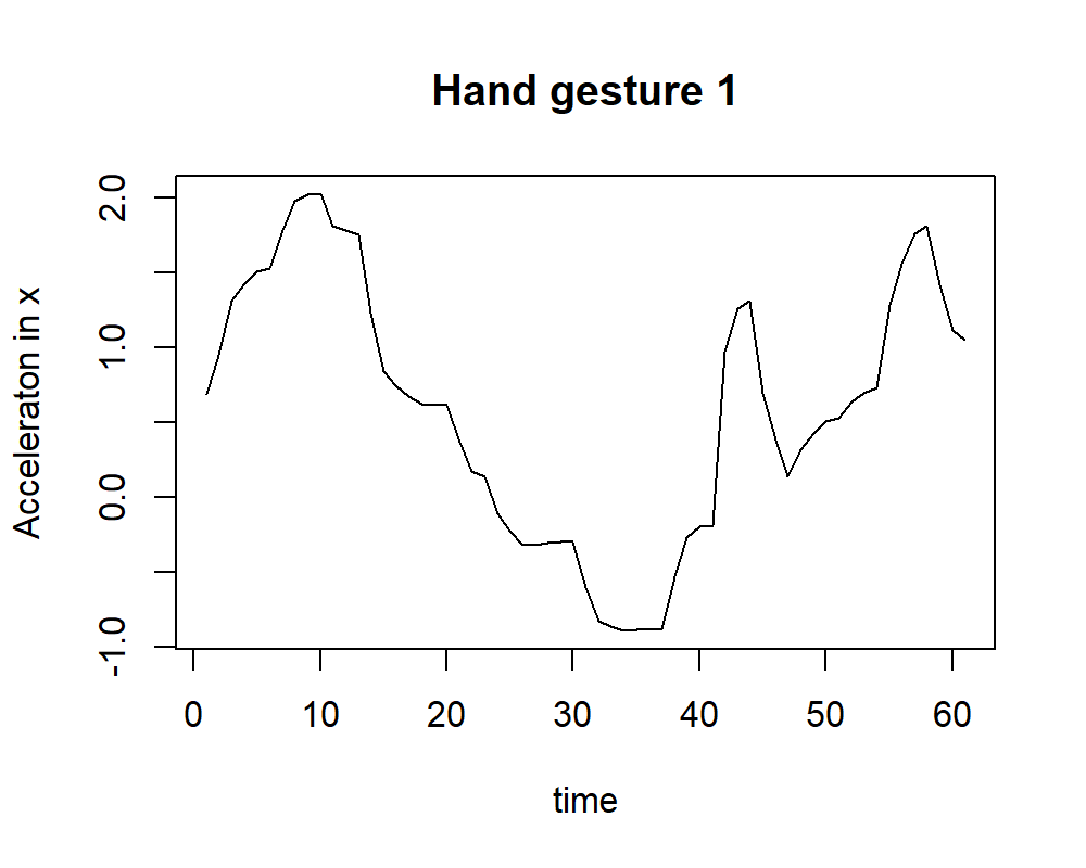
FIGURE 7.9: Acceleration of x of gesture 1.
Now the rp() function that we just defined is used to calculate the RP and distance matrix of vector x. We set a threshold of \(0.5\) and store the result in res.
Let’s first plot the distance matrix stored in res$D. The pheatmap() function can be used to generate the plot.
library(pheatmap)
pheatmap(res$D, main="Distance matrix of gesture 1", cluster_row = FALSE,
         cluster_col = FALSE,
         legend = F,
         color = colorRampPalette(c("white", "black"))(50))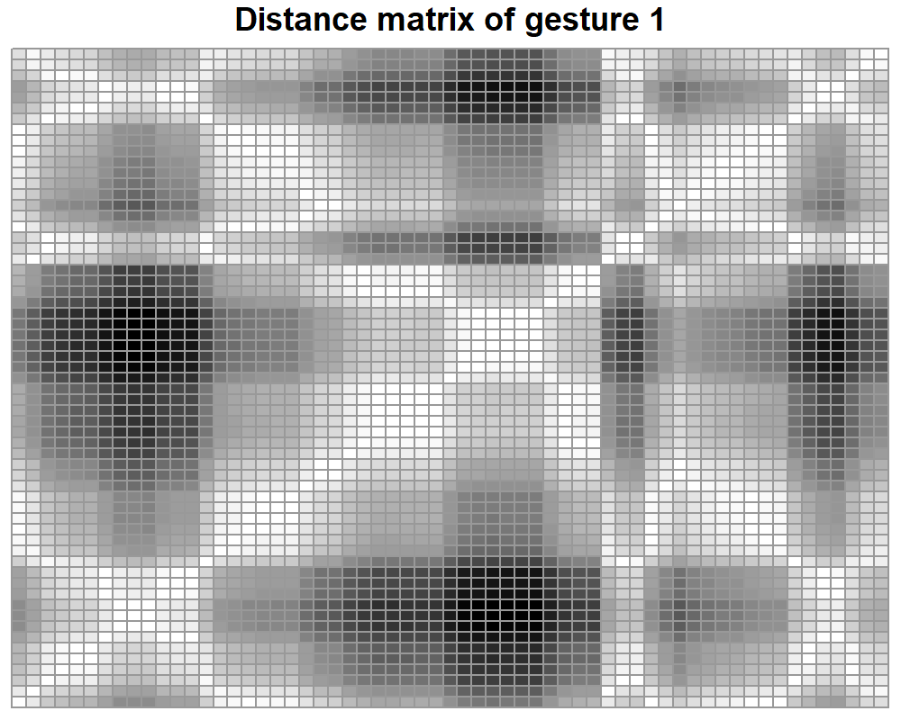
FIGURE 7.10: Distance matrix of gesture 1.
From figure 7.10 we can see that the diagonal cells are all white. Those represent values of \(0\), the distance between a point and itself. Apart from that, there are no other human intuitive patterns to look for. Now, let’s see how the recurrence plot stored in res$RP looks like (Figure 7.11).
pheatmap(res$RP, main="RP with threshold = 0.5", cluster_row = FALSE,
         cluster_col = FALSE,
         legend = F,
         color = colorRampPalette(c("white", "black"))(50))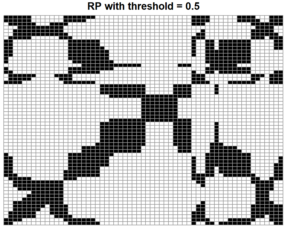
FIGURE 7.11: RP of gesture 1 with a threshold of 0.5.
Here, we see that this is kind of an inverted version of the distance matrix. Now, the diagonal is black because small distances are encoded as ones. There are also some clusters of points and vertical and horizontal line patterns. If we wanted to build a classifier, we would not need to interpret those extraterrestrial images. We could just treat each distance matrix or RP as an image and feed them directly to a CNN (CNNs will be covered in chapter 8).
Finally, we can try to see what happens if we change the threshold. Figure 7.12 shows two RPs. In the left one, a small threshold of \(0.01\) was used. Here, many details were lost and only very small distances show up. In the plot to the right, a threshold of \(1.5\) was used. Here, the plot is cluttered with black pixels which makes it difficult to see any patterns. On the other hand, a distance matrix will remain the same regardless of the threshold selection.
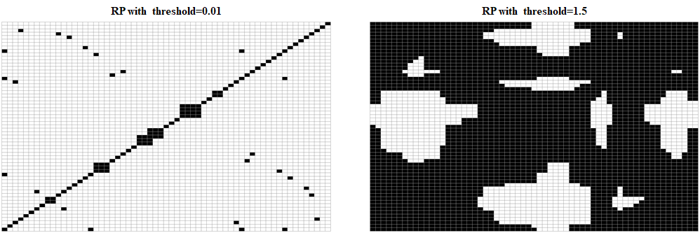
FIGURE 7.12: RP of gesture 1 with two different thresholds.
shiny_rp.R This shiny app allows you to select hand gestures, plot their corresponding distance matrix and recurrence plot, and see how the threshold affects the final result.
7.6 Bag-of-Words
The main idea of the Bag-of-Words (BoW) encoding is to represent a complex entity as a set of its constituent parts. It is called Bag-of-Words because one of the first applications was in natural language processing. Say there is a set of documents about different topics such as medicine, arts, engineering, etc., and you would like to classify them automatically based on their words. In BoW, each document is represented as a table that contains the unique words across all documents and their respective counts for each document. With this representation, one may see that documents about medicine will contain higher counts of words like treatment, diagnosis, health, etc., compared to documents about art or engineering. Figures 7.13 and 7.14 show the conceptual view and the table view, respectively.
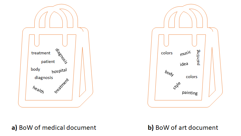
FIGURE 7.13: Conceptual view of two documents as BoW.
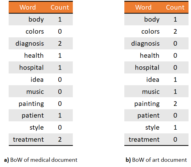
FIGURE 7.14: Table view of two documents as BoW.
From these representations, it is now easy to build a document classifier. The word-counts table can be used as an input feature vector. That is, each position in the feature vector represents a word and its value is an integer representing the total count for that word.
BoW can also be used for image classification in complex scenarios. For example when dealing with composed scenes like classrooms, parks, shops, and streets. First, the scene (document) can be decomposed into smaller elements (words) by identifying objects like trees, chairs, cars, cashiers, etc. In this case, instead of bags of words we have bags of objects but the idea is the same. The object identification part can be done in a supervised manner where there is already a classifier that assigns labels to objects.
Using a supervised approach can work in some simple cases but is not scalable for more complex ones. Why? Because the classifier would need to be trained for each type of object. Furthermore, those types of objects need to be manually defined beforehand. If we want to apply this method on scenes where most of their elements do not have a corresponding label in the object classifier we will be missing a lot of information and will end up having incomplete word count tables.
A possible solution is to instead, use an unsupervised approach. The image scene can be divided into squared (but not necessarily) patches. Conceptually, each patch may represent an independent object (a tree, a chair, etc.). Then, feature extraction can be performed on each patch so ultimately patches are encoded as feature vectors. Again, each feature vector represents an individual possible object inside the complex scene. At this point, those feature vectors do not have a label so we can’t build the BoW (table counts) for the whole scene. Then, how are those unlabeled feature vectors useful? We could use a pre-trained classifier to assign them labels –but we would be relying into the supervised approach along with its aforementioned limitations. Instead, we can use an unsupervised method, for example, k-means! which was presented in chapter 6.
We can cluster all the unlabeled feature vectors into \(k\) groups where \(k\) is the number of possible unique labels. After the clustering, we can compute the centroid of each group. To assign a label to an unlabeled feature vector, we can compute the closest centroid and use its id as the label. The id of each centroid can be an integer. Intuitively, similar feature vectors will end up in the same group. For example, there could be a group of objects that look like chairs, another for objects that look like cars, and so on. Usually, it may happen that elements in the same groups will not look similar for the human eye, but they are similar in the feature space. Also, the objects’ shape inside the groups may not make sense at all for the human eye. If the objective is to classify the complex scene, then we do not necessarily need to understand the individual objects nor do they need to have a corresponding mapping into a real-world object.
Once the feature vectors are labeled, we can build the word-count table but instead of having ‘meaningful’ words, the entries will be ids with their corresponding counts. As you might have guessed, one limitation is that we do not know how many clusters (labels) there should be for a given problem. One approach is to try out for different values of \(k\) and use the one that optimizes your performance metric of interest.
But, what this BoW thing has to do with behavior? Well, we can use this method to decompose complex behaviors into simpler ones and encode them as BoW as we will see in the next subsection for complex activities analysis.
Advantages
Able to represent complex situations/objects/etc., by decomposing them into simpler elements.
The resulting BoW can be very efficient and effective for classification tasks.
Can be used in several domains including text, computer vision, sensor data, and so on.
The BoW can be constructed in an unsupervised manner.
Limitations
Temporal and spatial information is not preserved.
It may require some effort to define how to generate the words.
There are cases where one needs to find the optimal number of words.
7.6.1 BoW for Complex Activities.
bagwords/bow_functions.R bagwords/bow_run.R
So far, I have been talking about BoW applications for text and images. In this section, I will show you how to decompose complex activities from accelerometer data into simpler activities and encode them as BoW. In chapters 2 and 3, we trained supervised models for simple activity recognition. Those activities were like: walking, jogging, standing, etc. For those, it is sufficient to divide them into windows of size equivalent to a couple of seconds in order to infer their labels. On the other hand, the duration of complex activities are longer and they are composed of many simple activities. One example is the activity shopping. When we are shopping we perform many different activities including walking, taking groceries, paying, standing while looking at the stands, and so on. Another example is commuting. When we commute, we need to walk but also take the train, or drive, or cycle.
Using the same approach for simple activity classification on complex ones may not work. Representing a complex activity using fixed-size windows can cause some conflicts. For example, a window may be covering the time span when the user was walking, but walking can be present in different types of complex activities. If a window happens to be part of a segment when the person was walking, there is not enough information to know which was the complex activity at that time. This is where BoW comes into play. If we represent a complex activity as a bag of simple activities then, a classifier will have an easier time differentiating between classes. For instance, when exercising, the frequencies (counts) of high-intensity activities (like running or jogging) will be higher compared to when someone is shopping.
In practice, it would be very tedious to manually label all possible simple activities to form the BoW. Instead, we will use the unsupervised approach discussed in the previous section to automatically label the simple activities so we only need to manually label the complex ones.
Here, I will use the COMPLEX ACTIVITIES dataset which consists of five complex activities: ‘commuting’, ‘working’, ‘being at home’, ‘shopping’ and ‘exercising’. The duration of the activities varies from some minutes to a couple of hours. Accelerometer data at \(50\) Hz. was collected with a cellphone placed in the user’s belt. The dataset has \(80\) accelerometer files, each representing a complex activity.
The task is to go from the raw accelerometer data of the complex activity to a BoW representation where each word will represent a simple activity. The overall steps are as follows:
- Divide the raw data into small fixed-length windows and generate feature vectors from them. Intuitively, these are the simple activities.
- Cluster the feature vectors.
- Label the vectors by assigning them to the closest centroid.
- Build the word-count table.
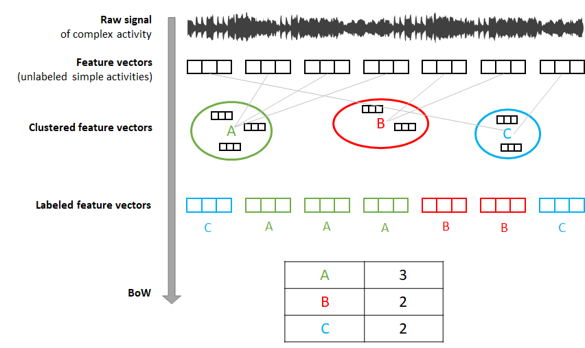
FIGURE 7.15: BoW steps. From raw signal to BoW table.
Figure 7.15 shows the overall steps graphically. All the functions to perform the above steps are implemented in bow_functions.R. The functions are called in the appropriate order in bow_run.R.
First of all, and to avoid overfitting, we need to hold out an independent set of instances. These instances will be used to generate the clusters and their respective centroids. The dataset is already divided into a train and test set. The train set contains \(13\) instances out of the \(80\). The remaining \(67\) are assigned to the test set.
In the first step, we need to extract the feature vectors from the raw data. This is implemented in the function extractSimpleActivities(). This function divides the raw data of each file into fixed-length windows of size \(150\) which corresponds to \(3\) seconds. Each window can be thought of as a simple activity. For each window, it extracts \(14\) features like mean, standard deviation, correlation between axes, etc. The output is stored in the folder simple_activities/. Each file corresponds to one of the complex activities and each row in a file is a feature vector (simple activity). At this time the feature vectors (simple activities) are unlabeled. Notice that in the script bow_run.R the function is called twice:
# Extract simple activities for train set.
extractSimpleActivities(train = TRUE)
# Extract simple activities for test set (may take some minutes).
extractSimpleActivities(train = FALSE)
This is because we divided the data into train and test sets. So we need to extract the features from both sets by setting the train parameter accordingly.
The second step consists of clustering the extracted feature vectors. To avoid overfitting, this step is only performed on the train set. The function clusterSimpleActivities() implements this step. The feature vectors are grouped into \(15\) groups. This can be changed by setting constants$wordsize <- 15 to some other value. The function stores all feature vectors from all files in a single data frame and runs \(k\)-means. Finally, the resulting centroids are saved in the text file clustering/centroids.txt inside the train set directory.
The next step is to label each feature vector (simple activity) by assigning it to its closest centroid. The function assignSimpleActivitiesToCluster() reads the centroids from the text file, and for each simple activity in the test set it finds the closest centroid using the Euclidean distance. The label (an integer from \(1\) to \(15\)) of the closest centroid is assigned and the resulting files are saved in the labeled_activities/ directory. Each file contains the assigned labels (integers) for the corresponding feature vectors file in the simple_activities/ directory. Thus, if a file inside simple_activities/ has \(100\) feature vectors then, its corresponding file in labeled_activities/ should have \(100\) labels.
In the last step, the function convertToHistogram() will generate the bag of words from the labeled activities. The BoW are stored as histograms (encoded as vectors) with each element representing a label and its corresponding counts. In this case, the labels are \(w1..w15\). The \(w\) stands for word and was only appended for clarity to show that this is a label. This function will convert the counts into percentages (normalization) in case we want to perform classification, that is, the percentage of time that each word (simple activity) occurred during the entire complex activity. The resulting histograms/histograms.csv file contains the BoW as one histogram per row. One per each complex activity. The first column is the complex activity’s label in text format.
Figures 7.16 and 7.17 show the histogram for one instance of ‘working’ and ‘exercising’. The x-axis shows the labels of the simple activities and the y-axis their relative frequencies.
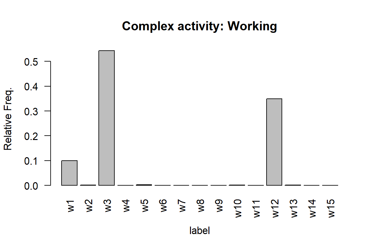
FIGURE 7.16: Histogram of working activity.
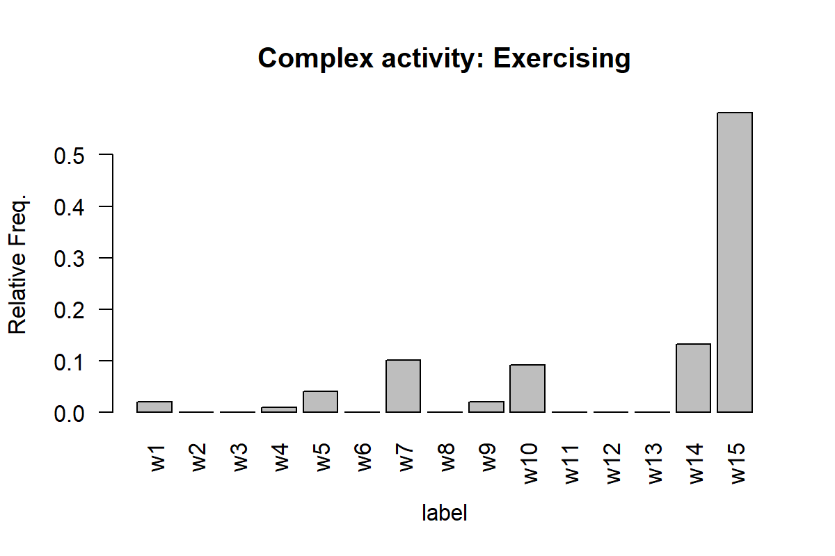
FIGURE 7.17: Histogram of exercising activity.
Here, we can see that the ‘working’ activity is composed mainly by the simple activities w1, w3, and w12. The exercising activity is mainly composed of w15 and w14 which perhaps are high-intensity movements like jogging or running.
7.7 Graphs
Graphs are one of the most general data structures (and my favorite one). The two basic components of a graph are its vertices and edges. Vertices are also called nodes and edges are also called arcs. Vertices are connected by edges. Figure 7.18 shows three different types of graphs. Graph (a) is an undirected graph that consists of \(3\) vertices and \(3\) edges. Graph (b) is a directed graph, that is, its edges have a direction. Graph (c) is a weighted directed graph because its edges have a direction and they also have an associated weight.
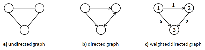
FIGURE 7.18: Three different types of graphs.
Weights can represent anything, for example, distances between cities or number of messages sent between devices. In the previous graph, the vertices also have a label (integer numbers but could be strings). In general, vertices and edges can have any number of attributes, not just weight and/or labels. Many data structures like binary trees and lists are graphs with constraints. For example, a list is also a graph in which all vertices are connected as a sequence: a->b->c. Trees are also graphs with the constraint that there is only one root node and nodes can only have edges to their children. Graphs are very useful to represent many types of real-world things like interactions, social relationships, geographical locations, the world wide web, and so on.
There are two main ways to encode a graph. The first one is as an adjacency list. An adjacency list consists of a list of tuples per node. The tuples represent edges. The first element of a tuple indicates the target node and the second element the weight of the edge. Figure 7.19-b shows the adjacency list representation of the corresponding weighted directed graph in the same figure.
The second main way to encode a graph is as an adjacency matrix. This is a square \(n\times n\) matrix where \(n\) is the number of nodes. Edges are represented as entries in the matrix. If there is an edge between node \(a\) and node \(b\), the corresponding cell contains the edge’s weight where rows represent the source nodes and columns the destination nodes. Otherwise, it contains a \(0\) or just an empty value. Figure 7.19-c shows the corresponding adjacency matrix. The disadvantage of the adjacency matrix is that for sparse graphs (many nodes and few edges), a lot of space is wasted. In practice, this can be overcome by using a sparse matrix implementation.
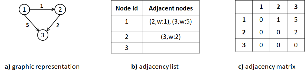
FIGURE 7.19: Different ways to store a graph.
Advantages:
- Many real-world situations can be naturally represented as graphs.
- Some partial order is preserved.
- Specialized graph analytics can be performed to gain insights and understand the data. See for example the book by Samatova et al. (2013).
- Can be plotted and different visual properties can be tuned to convey information such as edge width and colors, vertex size and color, distance between nodes, etc.
Limitations:
- Some graph analytic algorithms are computationally demanding.
- It can be difficult to use graphs to solve classification problems.
- It is not always clear if the data can be represented as a graph.
7.7.1 Complex Activities as Graphs
plot_graphs.R
In the previous section, it was shown how complex activities can be represented as Bag-of-Words. This was done by decomposing the complex activities into simpler ones. The BoW is composed of the simple activities counts (frequencies). In the process of building the BoW in the previous section, some intermediate text files stored in labeled_activities/ were generated. These files contain the sequence of simple activities (their ids as integers) that constitute the complex activity. From these sequences, histograms were generated and in doing so, the order was lost.
One thing we can do is build a graph where vertices represent simple activities and edges represent the interactions between them. For instance, if we have a sequence of simple activities ids like: \(3,2,2,4\) we can represent this as a graph with \(3\) vertices and \(3\) edges. One vertex per activity. The first edge would go from vertex \(3\) to vertex \(2\), the next one from vertex \(2\) to vertex \(2\), and so on. In this way we can use a graph to capture the interactions between simple activities.
The script plot_graphs.R implements a function named ids.to.graph() that reads the sequence files from labeled_activities/ and converts them into weighted directed graphs. The weight of the edge \((a,b)\) is equal to the total number of transitions from vertex \(a\) to vertex \(b\). The script uses the igraph package (Csardi and Nepusz 2006) to store and plot the resulting graphs. The ids.to.graph() function receives as its first argument the sequence of ids. Its second argument indicates whether the edge weights should be normalized or not. If normalized, the sum of all weights will be \(1\).
The following code snippet reads one of the sequence files, converts it into a graph, and plots the graph.
datapath <- "../labeled_activitires/"

# Select one of the 'work' complex activities.
filename <- "2_20120606-111732.txt"

# Read it as a data frame.
df <- read.csv(paste0(datapath, filename), header = F)

# Convert the sequence of ids into an igraph graph.
g <- ids.to.graph(df$V1, relative.weights = T)

# Plot the result.
set.seed(12345)
plot(g, vertex.label.cex = 0.7,
     edge.arrow.size = 0.2,
     edge.arrow.width = 1,
     edge.curved = 0.1,
     edge.width = E(g)$weight * 8,
     edge.label = round(E(g)$weight, digits = 3),
     edge.label.cex = 0.4,
     edge.color = "orange",
     edge.label.color = "black",
     vertex.color = "skyblue"
     )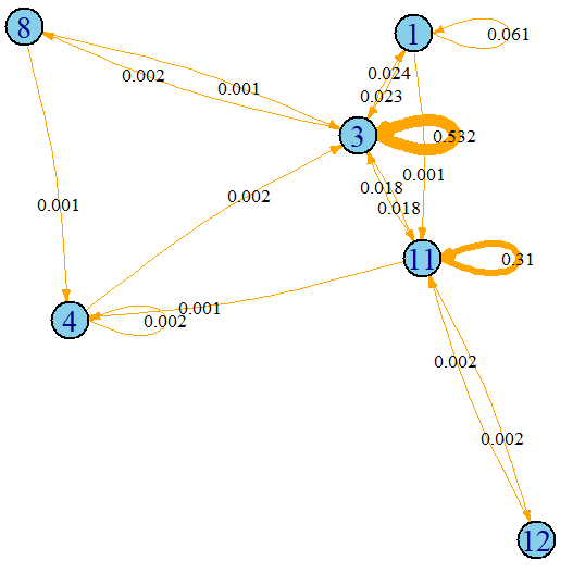
FIGURE 7.20: Complex activity ‘working’ plotted as a graph. Nodes are simple activities and edges transitions between them.
Figure 7.20 shows the resulting plot. The plot can be customized to change the vertex and edge color, size, curvature, etc. For more details please read the igraph package documentation.
The width of the edges is proportional to its weight. For instance, transitions from simple activity \(3\) to itself are very frequent (\(53.2\%\) of the time) for the ‘work’ complex activity, but transitions from \(8\) to \(4\) are very infrequent. Note that with this graph representation, some temporal dependencies are preserved but the complete sequence order is lost. Still this captures more information compared to BoW. The relationships between consecutive simple activities are preserved.
It is also possible to get the adjacency matrix with the method as_adjacency_matrix().
as_adjacency_matrix(g)

#> 6 x 6 sparse Matrix of class "dgCMatrix"
#>    1 11 12 3 4 8
#> 1  1  1  . 1 . .
#> 11 .  1  1 1 1 .
#> 12 .  1  . . . .
#> 3  1  1  . 1 . 1
#> 4  .  .  . 1 1 .
#> 8  .  .  . 1 1 .
In this matrix, there is a \(1\) if the edge is present and a ‘.’ if there is no edge. However, this adjacency matrix does not contain information about the weights. We can print the adjacency matrix with weights by specifying attr = "weight".
as_adjacency_matrix(g, attr = "weight")

#> 6 x 6 sparse Matrix of class "dgCMatrix"
#>             1          11         12           3           4          8
#> 1  0.06066946 0.001046025 .          0.023012552 .           .
#> 11 .          0.309623431 0.00209205 0.017782427 0.001046025 .
#> 12 .          0.002092050 .          .           .           .
#> 3  0.02405858 0.017782427 .          0.532426778 .           0.00209205
#> 4  .          .           .          0.002092050 0.002092050 .
#> 8  .          .           .          0.001046025 0.001046025 .
The adjacency matrices can then be used to train a classifier. Since many classifiers expect one-dimensional vectors and not matrices, we can flatten the matrix. This is left as an exercise for the reader to try. Which representation produces better classification results (adjacency matrix or BoW)?
7.8 Summary
Depending on the problem at hand, the data can be encoded in different forms. Representing data in a particular way, can simplify the problem solving process and the application of specialized algorithms. This chapter presented different ways in which data can be encoded along with some of their advantages/disadvantages.
- Feature vectors are fixed-size arrays that capture the properties of an instance. This is the most common form of data representation in machine learning.
- Most machine learning algorithms expect their inputs to be encoded as feature vectors.
- Transactions is another way in which data can be encoded. This representation is appropriate for association rule mining algorithms.
- Data can also be represented as images. Algorithms like CNNs (covered in chapter 8) can work directly on images.
- The Bag-of-Words representation is useful when we want to model a complex behavior as a composition of simpler ones.
- A graph is a general data structure composed of vertices and edges and is used to model relationships between entities.
- Sometimes it is possible to convert data into multiple representations. For example, timeseries can be converted into images, recurrence plots, etc.