Chapter 4 Exploring and Visualizing Behavioral Data
EDA.R
Exploratory data analysis (EDA) refers to the process of understanding your data. There are several available methods and tools for doing so, including summary statistics and visualizations. In this chapter, I will cover some of them. As mentioned in section 1.5, data exploration is one of the first steps of the data analysis pipeline. It provides valuable input to the decision process during the next data analysis phases, for example, the selection of preprocessing tasks and predictive methods. Even though there already exist several EDA techniques, you are not constrained by them. You can always apply any means that you think will allow you to better understand your data and gain new insights.
4.1 Talking with Field Experts
Sometimes you will be involved in the whole data analysis process starting with the idea, defining the research questions, hypotheses, conducting the data collection, and so on. In those cases, it is easier to understand the initial structure of the data since you might had been the one responsible for designing the data collection protocol.
Unfortunately (or fortunately for some), it is often the case that you are already given a dataset. It may have some documentation or not. In those cases, it becomes important to talk with the field experts that designed the study and the data collection protocol to understand what was the purpose and motivation of each piece of data. Again, it is often not easy to directly have access to those who conducted the initial study. One of the reasons may be that you found the dataset online and maybe the project is already over. In those cases, you can try to contact the authors. I have done that several times and they were very responsive. It is also a good idea to try to find experts in the field even if they were not involved in the project. This will allow you to understand things from their perspective and possibly to explain patterns/values that you may find later in the process.
4.2 Summary Statistics
After having a better understanding of how the data was collected and the meaning of each variable, the next step is to find out how the actual data looks like. It is always a good idea to start looking at some summary statistics. This provides general insights about the data and will help you in selecting the next preprocessing steps. In R, an easy way to do this is with the summary() function. The following code reads the SMARTPHONE ACTIVITIES dataset and due to limited space, only prints a summary of the first \(5\) columns, column \(33\), \(35\), and the last one (the class).
# Read activities dataset.
dataset <- read.csv(file.path(datasets_path,
                              "smartphone_activities",
                              "WISDM_ar_v1.1_raw.txt"),
                              stringsAsFactors = T)
# Print first 5 columns,
# column 33, 35 and the last one (the class).
summary(dataset[,c(1:5,33,35,ncol(dataset))])

#> UNIQUE_ID          user             X0                X1
#> Min.   :  1.0   Min.   : 1.00   Min.   :0.00000   Min.   :0.00000
#> 1st Qu.:136.0   1st Qu.:10.00   1st Qu.:0.06000   1st Qu.:0.07000
#> Median :271.0   Median :19.00   Median :0.09000   Median :0.10000
#> Mean   :284.4   Mean   :18.87   Mean   :0.09414   Mean   :0.09895
#> 3rd Qu.:412.0   3rd Qu.:28.00   3rd Qu.:0.12000   3rd Qu.:0.12000
#> Max.   :728.0   Max.   :36.00   Max.   :1.00000   Max.   :0.81000
#>
#> X2               XAVG        ZAVG             class
#> Min.   :0.00000   Min.   :0   ?0.22  :  29   Downstairs: 528
#> 1st Qu.:0.08000   1st Qu.:0   ?0.21  :  27   Jogging   :1625
#> Median :0.10000   Median :0   ?0.11  :  26   Sitting   : 306
#> Mean   :0.09837   Mean   :0   ?0.13  :  26   Standing  : 246
#> 3rd Qu.:0.12000   3rd Qu.:0   ?0.16  :  26   Upstairs  : 632
#> Max.   :0.95000   Max.   :0   ?0.23  :  26   Walking   :2081
#> (Other):5258
For numerical variables, the output includes some summary statistics like the min, max, mean, etc. For factor variables, the output is different. It displays the unique values with their respective counts. If there are more than six unique values, the rest is omitted. For example, the class variable (the last one) has \(528\) instances with the value ‘Downstairs’. By looking at the min and max values of the numerical variables, we see that those are not the same for all variables. For some variables, their maximum value is \(1\), for others, it is less than \(1\) and for some others, it is greater than \(1\). It seems that the variables are not in the same scale. This is important because some algorithms are sensitive to different scales. In chapters 2 and 3, we mainly used decision-tree-based algorithms which are not sensitive to different scales, but some others like neural networks are. In chapter 5, a method to transform variables into the same scale will be introduced.
The output of the summary() function also shows some strange values. The statistics of the variable XAVG are all \(0s\). Some other variables like ZAVG were encoded as characters and it seems that the ‘?’ symbol is appended to the numbers. In summary, the summary() function (I know, too many summaries in this sentence), allowed us to spot some errors in the dataset. What we do with that information will depend on the domain and application.
4.3 Class Distributions
When it comes to behavior sensing, many of the problems can be modeled as classification tasks. This means that there are different possible categories to choose from. It is often a good idea to plot the class counts (class distribution). The following code shows how to do that for the SMARTPHONE ACTIVITIES dataset. First, the table() method is used to get the actual class counts. Then, the plot is generated with ggplot (see Figure 4.1).
t <- table(dataset$class)
t <- as.data.frame(t)
colnames(t) <- c("class","count")

p <- ggplot(t, aes(x=class, y=count, fill=class)) +
  geom_bar(stat="identity", color="black") +
  theme_minimal() +
  geom_text(aes(label=count), vjust=-0.3, size=3.5) +
  scale_fill_brewer(palette="Set1")

print(p)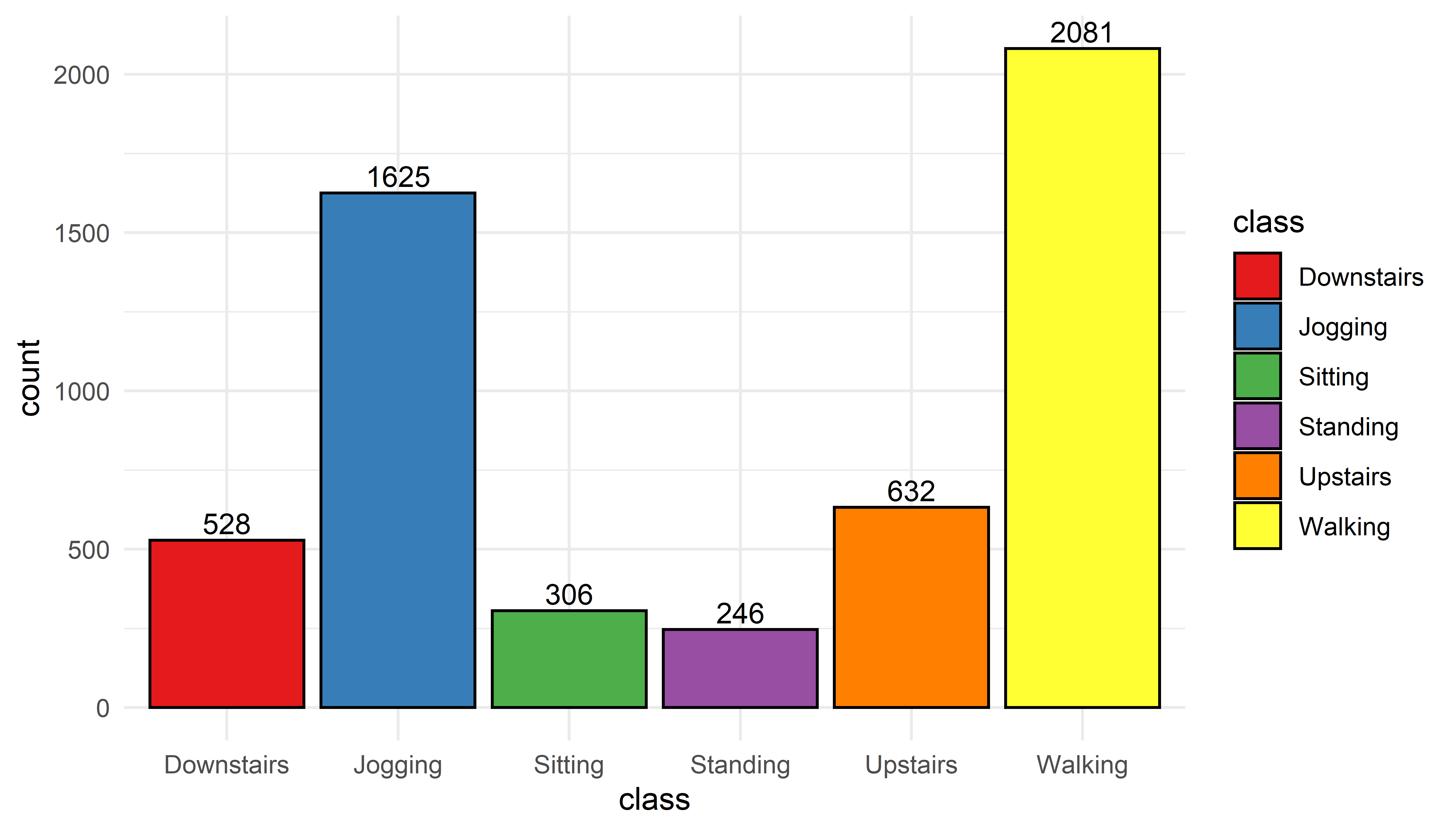
FIGURE 4.1: Distribution of classes.
The most common activity turned out to be ‘Walking’ with \(2081\) instances. It seems that the volunteers were a bit sporty since ‘Jogging’ is the second most frequent activity. One thing to note is that there are some big differences here. For example, ‘Walking’ vs. ‘Standing’. Those differences in class counts can have an impact when training classification models. This is because classifiers try to minimize the overall error regardless of the performance of individual classes, thus, they tend to prioritize the majority classes. This is called the class imbalance problem. This occurs when there are many instances of some classes but fewer of some other classes. For some applications this can be a problem. For example, in fraud detection, datasets have many legitimate transactions but just a few of illegal ones. This will bias a classifier to be good at detecting legitimate transactions but what we are really interested in is in detecting the illegal transactions. This is something very common to find in behavior sensing datasets. For example in the medical domain, it is much easier to collect data from healthy controls than from patients with a given condition. In chapter 5, some of the oversampling techniques that can be used to deal with the class imbalance problem will be presented.
4.4 User-class Sparsity Matrix
In behavior sensing, usually two things are involved: individuals and behaviors. Individuals will express different behaviors to different extents. For the activity recognition example, some persons may go jogging frequently while others may never go jogging at all. Some behaviors will be present or absent depending on each individual. We can plot this information with what I call a user-class sparsity matrix. Figure 4.2 shows this matrix for the activities dataset. The code to generate this plot is included in the script EDA.R.
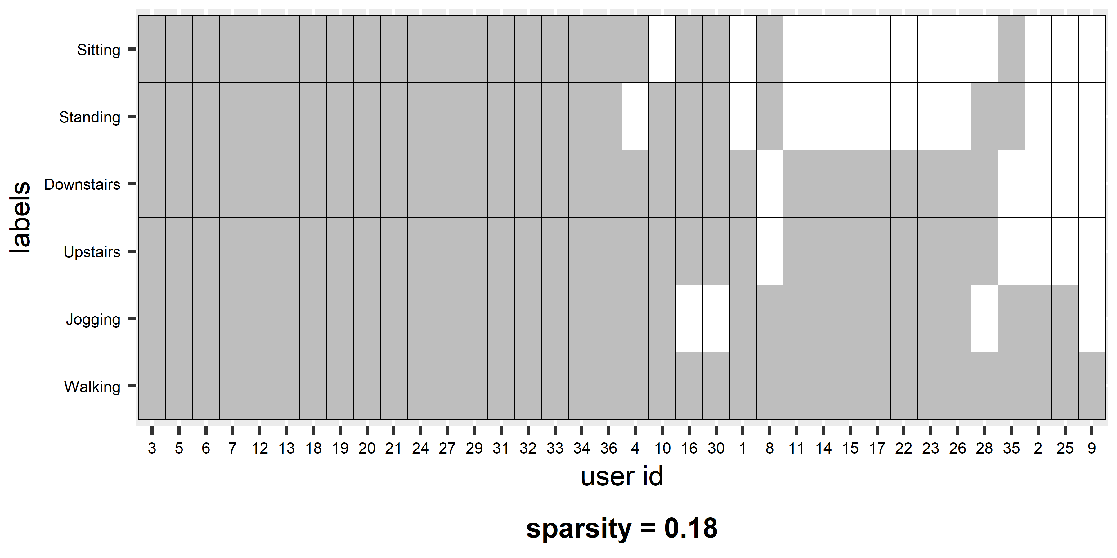
FIGURE 4.2: User-class sparsity matrix.
The x-axis shows the user ids and the y-axis the classes. A colored entry (gray in this case) means that the corresponding user has at least one associated instance of the corresponding class. For example, user \(3\) performed all activities and thus, the dataset contains at least one instance for each of the six activities. On the other hand, user \(25\) only has instances for two activities. Users are sorted in descending order (users that have more classes are at the left). At the bottom of the plot, the sparsity is shown (\(0.18\)). This is just the percentage of empty cells in the matrix. When all users have at least one instance of every class the sparsity is \(0\). When the sparsity is different from \(0\), one needs to decide what to do depending on the application. The following cases are possible:
Some users did not perform all activities. If the classifier was trained with, for example, \(6\) classes and a user never goes ‘jogging’, the classifier may still sometimes predict ‘jogging’ even if a particular user never does that. This can degrade the predictions’ performance for that particular user and can be worse if that user never performs other activities. A possible solution is to train different classifiers with different class subsets. If you know that some users never go ‘jogging’ then you train a classifier that excludes ‘jogging’ and use that one for that set of users. The disadvantage of this is that there are many possible combinations so you need to train many models. Since several classifiers can generate prediction scores and/or probabilities per class, another solution would be to train a single model with all classes and predict the most probable class excluding those that are not part of a particular user.
Some users can have unique classes. For example, suppose there is a new user that has an activity labeled as ‘Eating’ which no one else has, and thus, it was not included during training. In this situation, the classifier will never predict ‘Eating’ since it was not trained for that activity. One solution could be to add the new user’s data with the new labels and retrain the model. But if not too many users have the activity ‘Eating’ then, in the worst case, they will die from starvation. In a less severe case, the overall system performance can degrade because as the number of classes increases, it becomes more difficult to find separation boundaries between categories, thus, the models become less accurate. Another possible solution is to build user-dependent models for each user. These, and other types of models in multi-user settings will be covered in chapter 9.
4.5 Boxplots
Boxplots are a good way to visualize the relationship between variables and classes. R already has the boxplot() function. In the SMARTPHONE ACTIVITIES dataset, the RESULTANT variable represents the ‘total amount of movement’ considering the three axes (Kwapisz, Weiss, and Moore 2010). The following code displays a set of boxplots (one for each class) with respect to the RESULTANT variable (Figure 4.3).
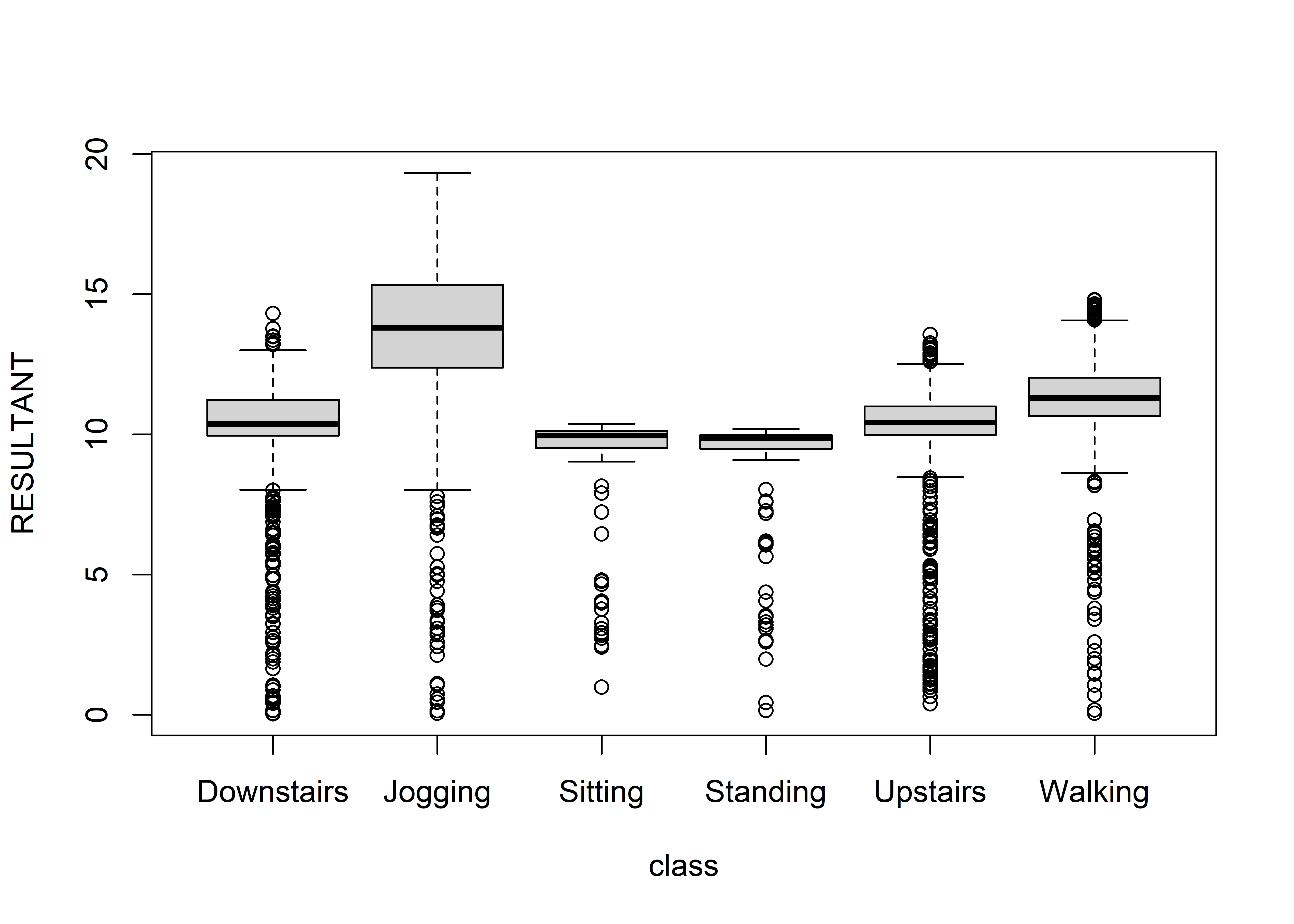
FIGURE 4.3: Boxplot of RESULTANT variable across classes.
The solid black line in the middle of each box marks the median7. Overall, we can see that this variable can be good at separating high-intensity activities like jogging, walking, etc. from low-intensity ones like sitting or standing. With boxplots we can inspect one feature at a time. If you want to visualize the relationship between predictors, correlation plots can be used instead. Correlation plots will be presented in the next subsection.
4.6 Correlation Plots
Correlation plots are useful for visualizing the relationships between pairs of variables. The most common type of relationship is the Pearson correlation. The Pearson correlation measures the degree of linear association between two variables. It takes values between \(-1\) and \(1\). A correlation of \(1\) means that as one of the variables increases, the other one does too. A value of \(-1\) means that as one of the variables increases, the other decreases. A value of \(0\) means that there is no association between the variables. Figure 4.4 shows several examples of correlation values. Note that the correlations of the examples at the bottom are all \(0\)s. Even though there are some noticeable patterns in some of the examples, their correlation is \(0\) because those relationships are not linear.
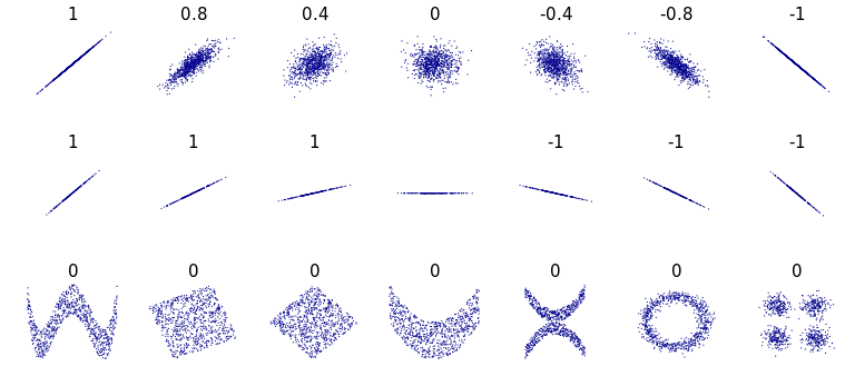
FIGURE 4.4: Pearson correlation examples. (Author: Denis Boigelot. Source: Wikipedia (CC0 1.0)).
The Pearson correlation (denoted by \(r\)) between two variables \(x\) and \(y\) can be calculated as follows:
\[\begin{equation} r = \frac{ \sum_{i=1}^{n}(x_i-\bar{x})(y_i-\bar{y}) }{ \sqrt{\sum_{i=1}^{n}(x_i-\bar{x})^2}\sqrt{\sum_{i=1}^{n}(y_i-\bar{y})^2}} \tag{4.1} \end{equation}\]
The following code snippet uses the corrplot library to generate a correlation plot (Figure 4.5) for the HOME TASKS dataset. Remember that this dataset contains two sets of features. One set extracted from audio and the other one extracted from the accelerometer sensor. First, the Pearson correlation between each pair of variables is computed with the cor() function and then the corrplot() function is used to generate the actual plot. Here, we specify that we only want to display the upper diagonal with type = "upper". The tl.pos argument controls where to print the labels. In this example, at the top and in the diagonal. Setting diag = FALSE instructs the function not to print the principal diagonal which is all ones since it is the correlation between each variable and itself.
library(corrplot)

# Load home activities dataset.
dataset <- read.csv(file.path(datasets_path,
                              "home_tasks",
                              "sound_acc.csv"))

CORRS <- cor(dataset[,-1])
corrplot(CORRS, diag = FALSE, tl.pos = "td", tl.cex = 0.5,
         method = "color", type = "upper")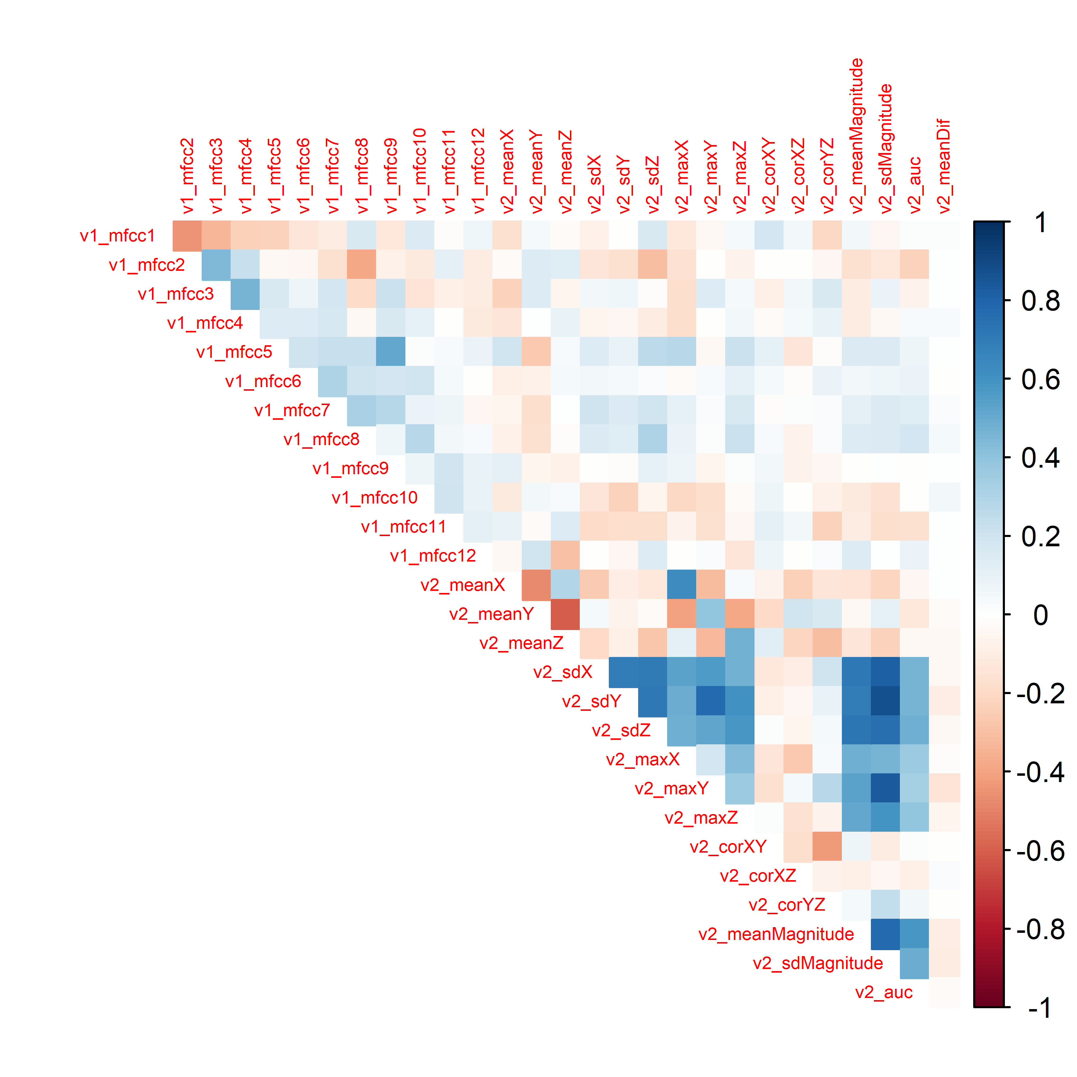
FIGURE 4.5: Correlation plot of the HOME TASKS dataset.
It looks like the correlations between sound features (v1_) and acceleration features (v2_) are not too high. In this case, this is good since we want both sources of information to be as independent as possible so that they capture different characteristics and complement each other as explained in section 3.4. On the other hand, there are high correlations between some acceleration features. For example v2_maxY with v2_sdMagnitude.
4.6.1 Interactive Correlation Plots
When plotting correlation plots, it is useful to also visualize the actual correlation values. When there are many variables, it becomes difficult to do that. One way to overcome this limitation is by using interactive plots. The following code snippet uses the function iplotCorr() from the qtlcharts package to generate an interactive correlation plot. The nice thing about it, is that you can actually inspect the cell values by hovering the mouse. If you click on a cell, the corresponding scatter plot is also rendered. This makes these types of plots very convenient tools to explore variable relationships.
library(qtlcharts) # Library for interactive plots.

# Load home activities dataset.
dataset <- read.csv(file.path(datasets_path,
                              "home_tasks",
                              "sound_acc.csv"))

iplotCorr(dataset[,-1], reorder=F,
          chartOpts=list(cortitle="Correlation matrix",
scattitle="Scatterplot"))4.7 Timeseries
Behavior is something that usually depends on time. Thus, being able to visualize timeseries data is essential. To illustrate how timeseries data can be plotted, I will use the ggplot package and the HAND GESTURES dataset. Recall that the data was collected with a tri-axial accelerometer, thus, for each hand gesture we have \(3\)-dimensional timeseries. Each dimension represents one of the x, y, and z axes. First, we read one of the text files that stores a hand gesture from user \(1\). Each column represents an axis. Then, we need to do some formatting. We will create a data frame with three columns. The first one is a timestep represented as integers from \(1\) to the number of points per axis. The second column is a factor that represents the axis x, y, or z. The last column contains the actual values.
dataset <- read.csv(file.path(datasets_path,
                              "hand_gestures/1/1_20130703-120056.txt"),
                    header = F)
# Do some preprocessing.
type <- c(rep("x", nrow(dataset)),
          rep("y", nrow(dataset)),
          rep("z", nrow(dataset)))
type <- as.factor(type)
values <- c(dataset$V1, dataset$V2, dataset$V3)
t <- rep(1:nrow(dataset), 3)
df <- data.frame(timestep = t, type = type, values = values)

# Print first rows.
head(df)
#>   timestep type    values
#> 1        1    x 0.6864655
#> 2        2    x 0.9512450
#> 3        3    x 1.3140911
#> 4        4    x 1.4317709
#> 5        5    x 1.5102241
#> 6        6    x 1.5298374
Note that the last column (values) contains the values of all axes instead of having one column per axis. Now we can use the ggplot() function. The lines are colored by type of axis and this is specified with colour = type. The type column should be a factor. The line type is also dependent on the type of axis and is specified with linetype = type. The resulting plot is shown in Figure 4.6.
tsPlot <- ggplot(data = df,
                   aes(x = timestep,
                       y = values,
                       colour = type,
                       linetype = type)) +
  ggtitle("Hand gesture '1', user 1") +
  xlab("Timestep") +
  ylab("Acceleration") +
  geom_line(aes(color=type)) +
  theme_minimal() +
  theme(plot.title = element_text(hjust = 0.5),
        legend.position="right",
        legend.key.width = unit(1.0,"cm"),
        legend.key.size = unit(0.5,"cm"))
print(tsPlot)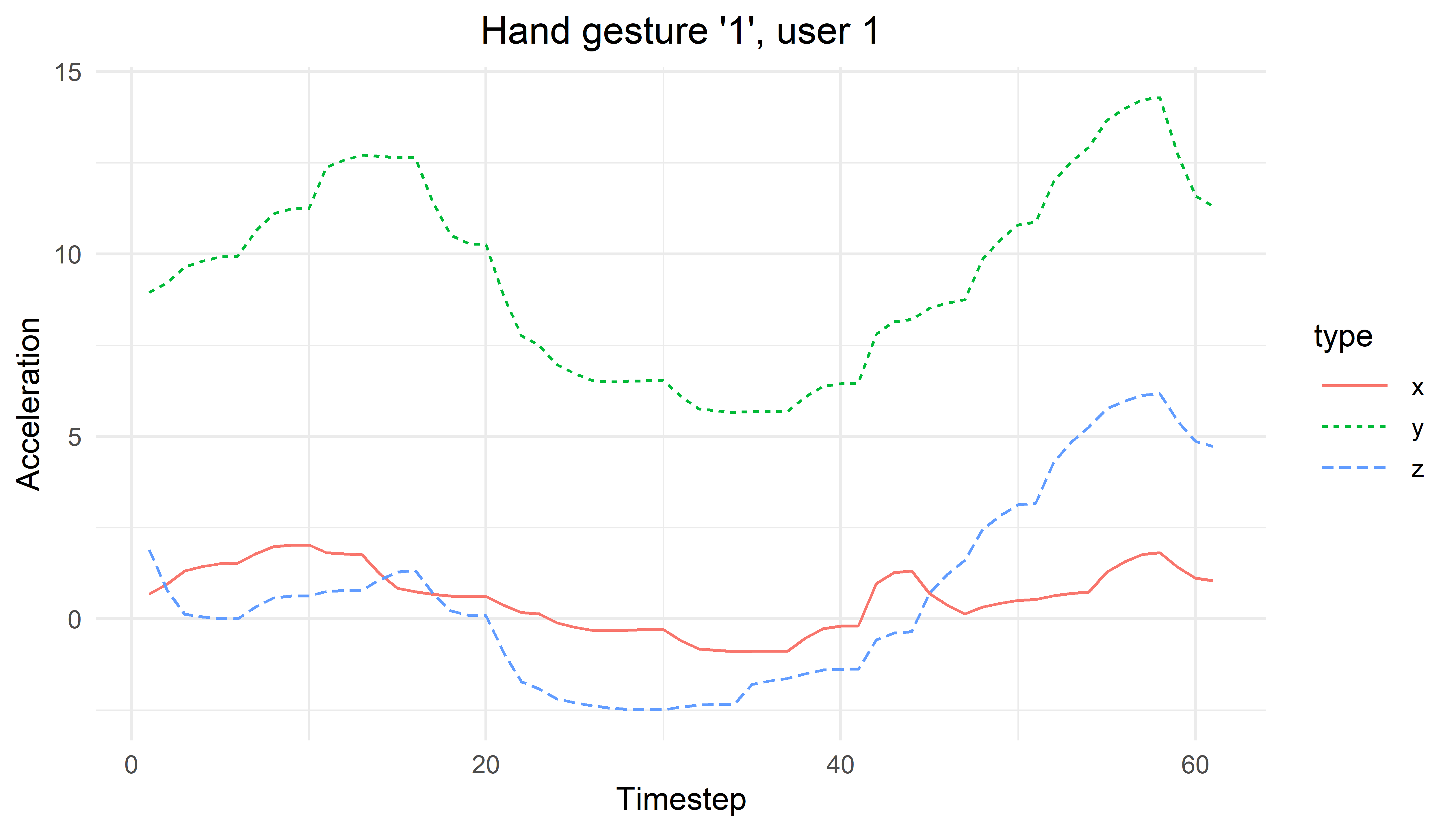
FIGURE 4.6: Timeseries plot for hand gesture ‘1’ user 1.
4.7.1 Interactive Timeseries
Sometimes it is useful to interactively zoom, highlight, select, etc. parts of the plot. In R, there is a package called dygraphs (Vanderkam et al. 2018) that generates fancy interactive plots for timeseries data8. The following code snippet reads a hand gesture file and adds a column at the beginning called timestep.
library(dygraphs)

# Read the hand gesture '1' for user 1.
dataset <- read.csv(file.path(datasets_path,
                              "hand_gestures/1/1_20130703-120056.txt"),
                    header = F,
                    col.names = c("x","y","z"))

dataset <- cbind(timestep = 1:nrow(dataset), dataset)
Then we can generate a minimal plot with one line of code with:
If you run the code, you will be able to zoom in by clicking and dragging over a region. A double click will restore the zoom. It is possible to add a lot of customization to the plots. For example, the following code adds a text title, fills the area under the lines, adds a point of interest line, and shades the region between \(30\) and \(40\).
4.8 Multidimensional Scaling (MDS)
iterative_mds.R
In many situations, our data is comprised of several variables. If the number of variables is more than \(3\) (\(3\)-dimensional data), it becomes difficult to plot the relationships between data points. Take, for example, the HOME TASKS dataset which has \(27\) predictor variables from accelerometer and sound. One thing that we may want to do is to visually inspect the data points and check whether or not points from the same class are closer compared to points from different classes. This can give you an idea of the difficulty of the problem at hand. If points of the same class are very close and grouped together then, it is likely that a classification model will not have trouble separating the data points. But how do we plot such relationships with high dimensional data? One method is by using multidimensional scaling (MDS) which consists of a set of techniques aimed at reducing the dimensionality of data so it can be visualized in \(2\)D or \(3\)D. The objective is to plot the data such that the original distances between pairs of points are preserved in a given lower dimension \(d\).
There exist several MDS methods but most of them take a distance matrix as input (for example, Euclidean distance). In R, generating a distance matrix from a set of points is easy. As an example, let’s generate some sample data points.
# Generate 3 2D random points.
x <- runif(3)
y <- runif(3)
df <- data.frame(x,y)
labels <- c("a","b","c")
print(df)
#>           x         y
#> 1 0.4457900 0.5978606
#> 2 0.4740106 0.5019398
#> 3 0.8890085 0.4109234
The dist() function can be used to compute the distance matrix. By default, this function computes the Euclidean distance between rows:
The output is the Euclidean distance between the pairs of rows \((1,2)\), \((1,3)\) and \((2,3)\).
One way to obtain cartesian coordinates in a \(d\) dimensional space for \(n\) points from their distance matrix \(D\) is to use an iterative algorithm (Borg, Groenen, and Mair 2012). Such an algorithm consists of the following general steps:
- Initialize \(n\) data points with random coordinates \(C\) of dimension \(d\).
- Compute a distance matrix \(D'\) from \(C\).
- Move the coordinates \(C\) such that the distances of \(D'\) get closer to the original ones in \(D\).
- Repeat from step \(2\) until the error between \(D'\) and \(D\) cannot be reduced any further or until some predefined max number of iterations.
The script iterative_mds.R implements this algorithm (iterativeMDS() function) which is based on the implementation from (Segaran 2007). Its first argument D is a distance matrix, the second argument maxit is the total number of iterations and the last argument lr controls how fast the points are moved in each iteration. The script also shows how to apply the method to the eurodist dataset which consists of distances between several European cities. Figure 4.7 shows the initial random coordinates of the cities. Then, Figure 4.8 shows the result after \(30\) iterations. Finally, Figure 4.9 shows the final result. By only knowing the distance matrix, the algorithm was able to find a visual mapping that closely resembles the real positions.
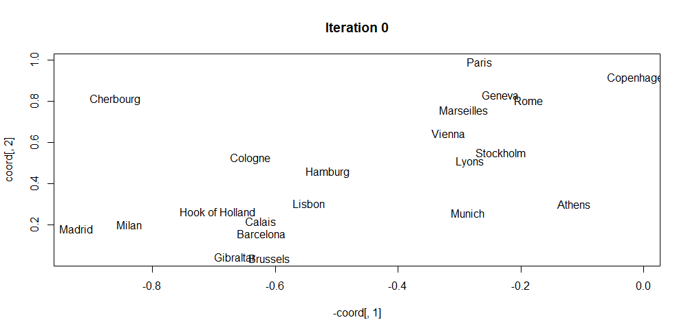
FIGURE 4.7: MDS initial coordinates.
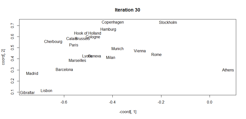
FIGURE 4.8: MDS coordinates after iteration 30.
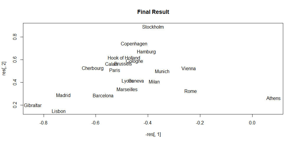
FIGURE 4.9: MDS final coordinates.
R already has efficient implementations to perform MDS and one of them is via the function cmdscale(). Its first argument is a distance matrix and the second argument \(k\) is the target dimension. It also has some other additional parameters that can be tuned. This function implements classical MDS based on Gower (1966). The following code snippet uses the HOME TASKS dataset. It selects the accelerometer-based features (v2_*), uses the cmdscale() function to reduce them into \(2\), dimensions and plots the result.
dataset <- read.csv(file.path(datasets_path, "home_tasks/sound_acc.csv"))
colNames <- names(dataset)
v2cols <- colNames[grep(colNames, pattern = "v2_")]
cols <- as.integer(dataset$label)
labels <- unique(dataset$label)
d <- dist(dataset[,v2cols])
fit <- cmdscale(d, k = 2) # k is the number of dim
x <- fit[,1]; y <- fit[,2]

plot(x, y, xlab="Coordinate 1",
     ylab="Coordinate 2",
     main="Accelerometer features in 2D",
     pch=19,
     col=cols,
     cex=0.7)
legend("topleft",
       legend = labels,
       pch=19,
       col=unique(cols),
       cex=0.7,
       horiz = F)
We can also reduce the data into \(3\) dimensions and use the scatterplot3d package to generate a \(3\)D scatter plot:
library(scatterplot3d)
fit <- cmdscale(d,k = 3)
x <- fit[,1]; y <- fit[,2]; z <- fit[,3]
scatterplot3d(x, y, z,
              xlab = "",
              ylab = "",
              zlab = "",
              main="Accelerometer features in 3D",
              pch=19,
              color=cols,
              tick.marks = F,
              cex.symbols = 0.5,
              cex.lab = 0.7,
              mar = c(1,0,1,0))

legend("topleft",legend = labels,
       pch=19,
       col=unique(cols),
       cex=0.7,
       horiz = F)
From those plots, it can be seen that the different points are more or less grouped together based on the type of activity. Still, there are several points with no clear grouping which would make them difficult to classify. In section 3.4 of chapter 3, we achieved a classification accuracy of \(85\%\) when using only the accelerometer data.
4.9 Heatmaps
Heatmaps are a good way to visualize the ‘intensity’ of events. For example, a heatmap can be used to depict website interactions by overlapping colored pixels relative to the number of clicks. This visualization eases the process of identifying the most relevant sections of the given website, for example. In this section, we will generate a heatmap of weekly motor activity behaviors of individuals with and without diagnosed depression. The DEPRESJON dataset will be used for this task. It contains motor activity recordings captured with an actigraphy device which is like a watch but has several sensors including accelerometers. The device registers the amount of movement every minute. The data contains recordings of \(23\) patients and \(32\) controls (those without depression). The participants wore the device for \(13\) days on average.
The accompanying script auxiliary_eda.R has the function computeActivityHour() that returns a matrix with the average activity level of the depressed patients or the controls (those without depression). The matrix dimension is \(24\times7\) and it stores the average activity level at each day and hour. The type argument is used to specify if we want to compute this matrix for the depressed or control participants.
source("auxiliary_eda.R")

# Generate matrix with mean activity levels
# per hour for the control and condition group.
map.control <- computeActivityHour(datapath, type = "control")
map.condition <- computeActivityHour(datapath, type = "condition")
Since we want to compare the heatmaps of both groups we will normalize the matrices such that the values are between \(0\) and \(1\) in both cases. The script also contains a method normalizeMatrices() to do the normalization.
Then, the pheatmap package (Kolde 2019) can be used to create the actual heatmap from the matrices.
library(pheatmap)
library(gridExtra)

# Generate heatmap of the control group.
a <- pheatmap(res$M1, main="control group",
              cluster_row = FALSE,
              cluster_col = FALSE,
              show_rownames = T,
              show_colnames = T,
              legend = T,
              color = colorRampPalette(c("white",
                                         "blue"))(50))

# Generate heatmap of the condition group.
b <- pheatmap(res$M2, main="condition group",
              cluster_row = FALSE,
              cluster_col = FALSE,
              show_rownames = T,
              show_colnames = T,
              legend = T, color = colorRampPalette(c("white",
                                                     "blue"))(50))

# Plot both heatmaps together.
grid.arrange(a$gtable, b$gtable, nrow=2)
Figure 4.10 shows the two heatmaps. Here, we can see that overall, the condition group has lower activity levels. It can also be observed that people in the control group wakes up at around 6:00 but in the condition group, the activity starts to increase until 7:00 in the morning. Activity levels around midnight look higher during weekends compared to weekdays.
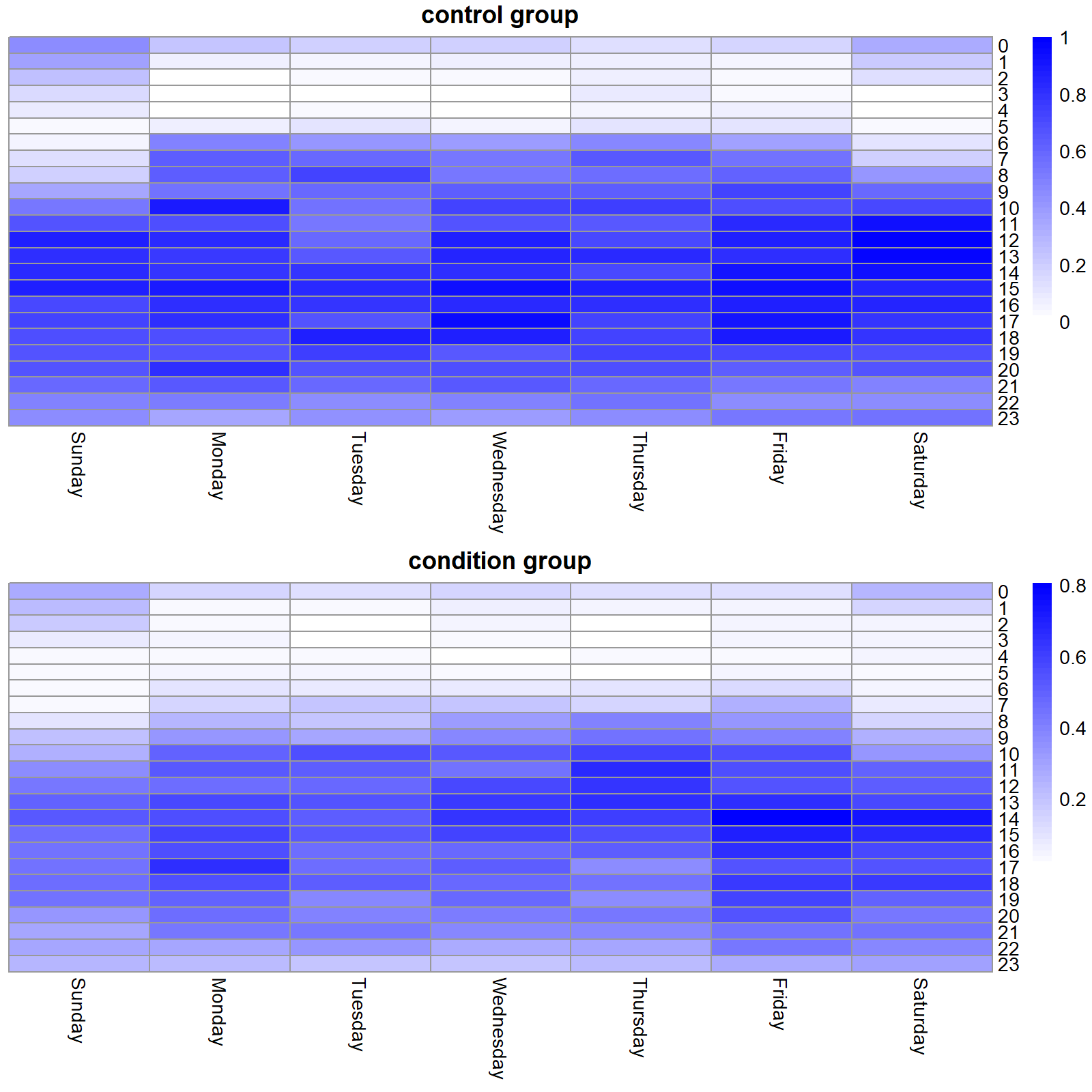
FIGURE 4.10: Activity level heatmaps for the control and condition group.
All in all, heatmaps provide a good way to look at the overall patterns of a dataset and can provide some insights to further explore some aspects of the data.
4.10 Automated EDA
Most of the time, doing an EDA involves more or less the same steps: print summary statistics, generate boxplots, visualize variable distributions, look for missing values, etc. If your data is stored as a data frame, all those tasks require almost the same code. To speed up this process, some packages have been developed. They provide convenient functions to explore the data and generate automatic reports.
The DataExplorer package (Cui 2020) has several interesting functions to explore a dataset. The following code uses the plot_str() function to plot the structure of dataset which is a data frame read from the HOME TASKS dataset. The complete code is available in script EDA.R. The output is shown in Figure 4.11. This plot shows the number of observations, the number of variables, the variable names, and their types.
library(DataExplorer)
dataset <- read.csv(file.path(datasets_path, "home_tasks/sound_acc.csv"))
plot_str(dataset)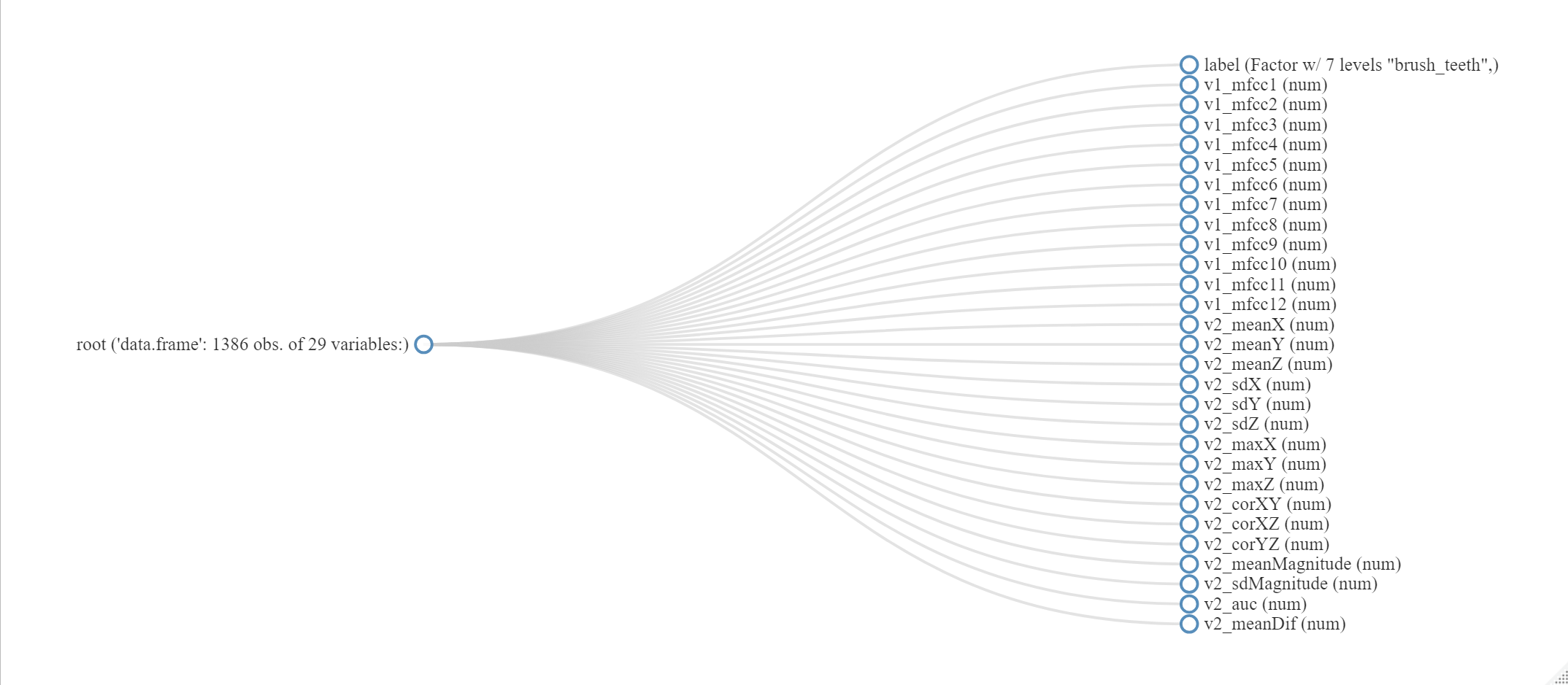
FIGURE 4.11: Output of function plotstr().
Another useful function is introduce(). This one prints some statistics like the number of rows, columns, missing values, etc. Table 4.1 shows the output result.
| rows | 1386 |
| columns | 29 |
| discrete_columns | 1 |
| continuous_columns | 28 |
| all_missing_columns | 0 |
| total_missing_values | 0 |
| complete_rows | 1386 |
| total_observations | 40194 |
| memory_usage | 328680 |
The package provides more functions to explore your data. The create_report() function can be used to automatically call several of those functions and generate a report in html. The package also offers functions to do feature engineering such as replacing missing values, create dummy variables (covered in chapter 5), etc. For a more detailed presentation of the package’s capabilities please check its vignette9.
There is another similar package called inspectdf (Rushworth 2019) which has similar functionality. It also offers some functions to check if the categorical variables are imbalanced. This is handy if one of the categorical variables is the response variable (the one we want to predict) since having imbalanced classes may pose some problems (more on this in chapter 5). The following code generates a plot (Figure 4.12) that represents the counts of categorical variables. This dataset only has one categorical variable: label.
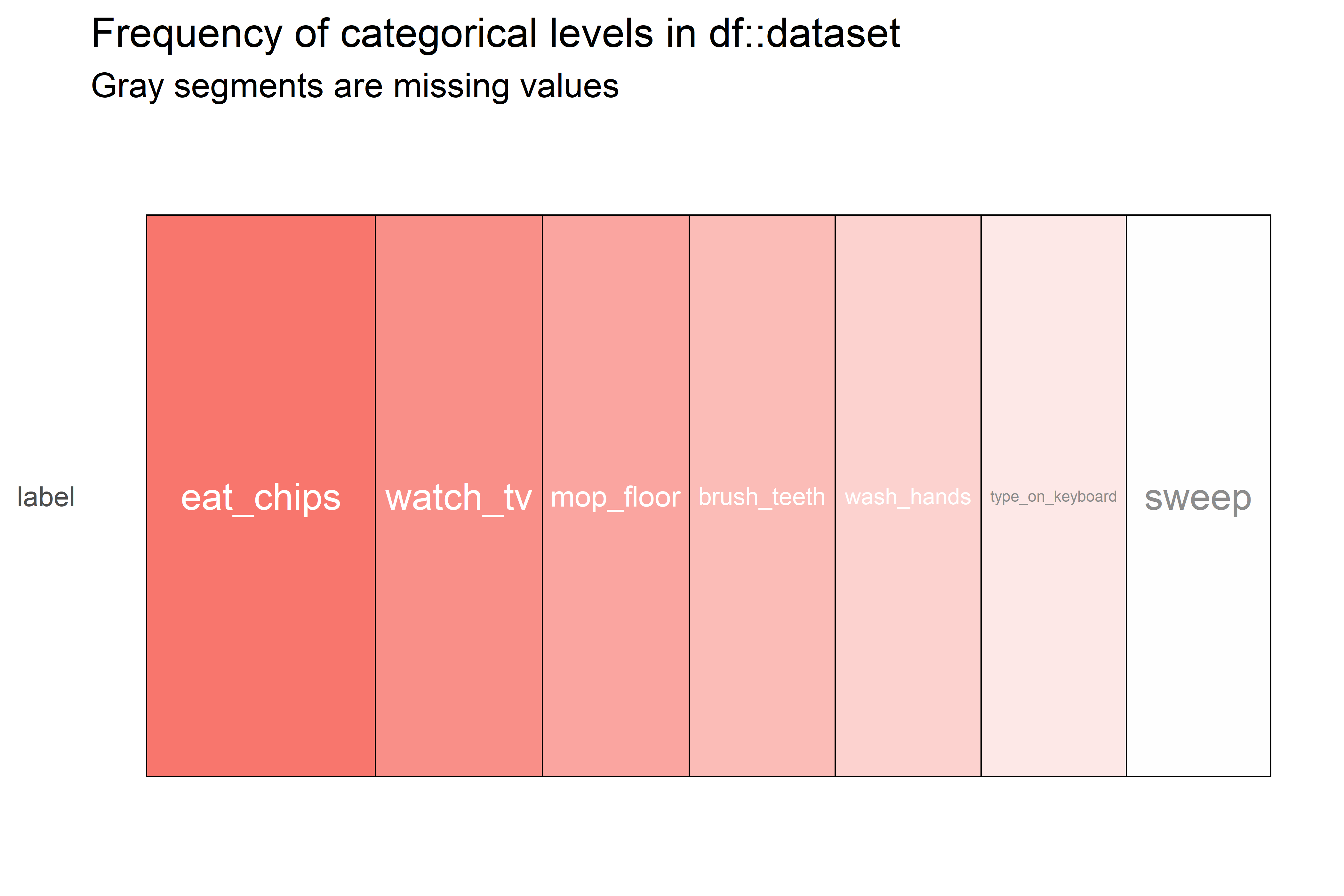
FIGURE 4.12: Heatmap of counts of categorical variables.
Here, we can see that the most frequent class is ‘eat_chips’ and the less frequent one is ‘sweep’. We can confirm this by printing the actual counts:
table(dataset$label)
#>      brush_teeth    eat_chips  mop_floor   sweep type_on_keyboard
#>              180          282        181     178              179
#>       wash_hands     watch_tv
#> 180 2064.11 Summary
One of the first tasks in a data analysis pipeline is to familiarize yourself with the data. There are several techniques and tools that can provide support during this process.
- Talking with field experts can help you to better understand the data.
- Generating summary statistics is a good way to gain general insights of a dataset. In R, the
summary()function will compute such statistics. - For classification problems, one of the first steps is to check the distribution of classes.
- In multi-user settings, generating a user-class sparsity matrix can be useful to detect missing classes per user.
- Boxplots and correlation plots are used to understand the behavior of the variables.
- R, has several packages for creating interactive plots such as
dygraphsfor timeseries andqtlchartsfor correlation plots. - Multidimensional scaling (MDS) can be used to project high-dimensional data into \(2\) or \(3\) dimensions so they can be plotted.
- R has some packages like
DataExplorerthat provide some degree of automation for exploring a dataset.
References
For a more complete explanation about boxplots please see: https://towardsdatascience.com/understanding-boxplots-5e2df7bcbd51↩︎
For a comprehensive list of available features of the
dygraphpackage, the reader is advised to check its demos website: https://rstudio.github.io/dygraphs/index.html↩︎https://cran.r-project.org/web/packages/DataExplorer/vignettes/dataexplorer-intro.html↩︎