Chapter 10 Detecting Abnormal Behaviors
Abnormal data points are instances that are rare or do not occur very often. They are also called outliers. Some examples include illegal bank transactions, defective products, natural disasters, etc. Detecting abnormal behaviors is an important topic in the fields of health care, ecology, economy, psychology, and so on. For example, abnormal behaviors in wildlife creatures can be an indication of abrupt changes in the environment and rare behavioral patterns in a person may be an indication of health deterioration.
Anomaly detection can be formulated as a binary classification task and solved by training a classifier to distinguish between normal and abnormal instances. The problem with this approach is that anomalous points are rare and there may not be enough to train a classifier. This can also lead to class imbalance problems. Furthermore, the models should be able to detect abnormal points even if they are very different from the training data. To address those issues, several anomaly detection methods have been developed over the years and this chapter introduces two of them: Isolation Forests and autoencoders.
This chapter starts by explaining how Isolation Forests work and then, an example of how to apply them for abnormal trajectory detection is presented. Next, a method (ROC curve) to evaluate the performance of such models is described. Finally, another method called autoencoder that can be used for anomaly detection is explained and applied to the abnormal trajectory detection problem.
10.1 Isolation Forests
As its name implies, an Isolation Forest identifies anomalous points by explicitly ‘isolating’ them. In this context isolation means separating an instance from the others. This approach is different from many other anomaly detection algorithms where they first build a profile of normal instances and mark an instance as an anomaly if it does not conform to the normal profile. Isolation Forests were proposed by Liu, Ting, and Zhou (2008) and the method is based on building many trees (similar to Random Forests, chapter 3). This method has several advantages including its efficiency in terms of time and memory usage. Another advantage is that at training time it does not need to have examples of the abnormal cases but if available, they can be incorporated as well. Since this method is based on trees, another nice thing about it is that there is no need to scale the features.
This method is based on the observation that anomalies are ‘few and different’ which makes them easier to isolate. It is based on building an ensemble of trees where each tree is called an Isolation Tree. Each Isolation Tree partitions the features until every instance is isolated (it’s at a leaf node). Since anomalies are easier to isolate they will be closer to the root of the tree. An instance is marked as an anomaly if its average path length to the root across all Isolation Trees is short.
A tree is generated recursively by randomly selecting a feature and then selecting a random partition between the maximum and minimum value of that feature. Each partition corresponds to a split in a tree. The procedure terminates when all instances are isolated. The number of partitions that were required to isolate a point corresponds to the path length of that point to the root of the tree.
Figure 10.1 shows a set of points with only one feature (x axis). One of the anomalous points is highlighted as a red triangle. One of the normal points is marked as a blue solid circle.
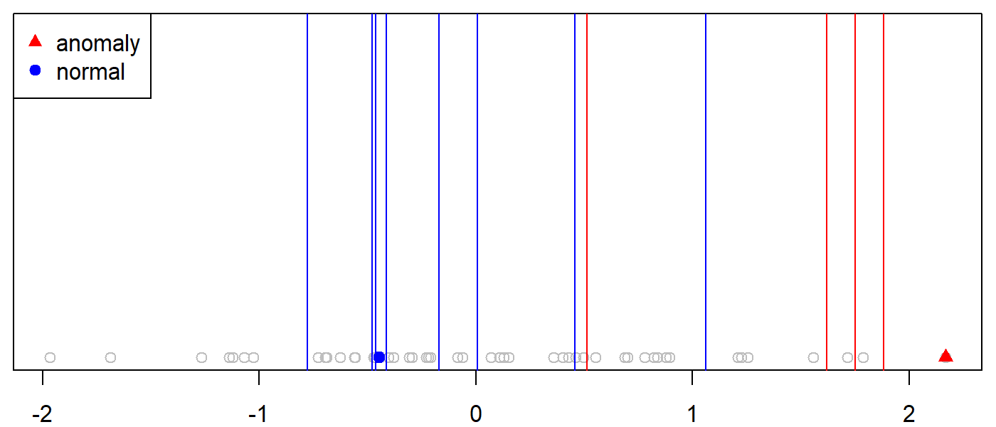
FIGURE 10.1: Example partitioning of a normal and an anomalous point.
To isolate the anomalous instance, we can randomly and recursively choose partition positions (vertical lines in Figure 10.1) until the instance is encapsulated in its own partition. In this example, it took \(4\) partitions (red lines) to isolate the anomalous instance, thus, the path length of this instance to the root of the tree is \(4\). The partitions were located at \(0.51, 1.6, 1.7,\) and \(1.8\). The code to reproduce this example is in the script example_isolate_point.R. If we look at the highlighted normal instance we can see that it took \(8\) partitions to isolate it.
Instead of generating a single tree, we can generate an ensemble of \(n\) trees and average their path lengths. Figure 10.2 shows the average path length for the same previous normal and anomalous instances as the number of trees in the ensemble is increased.
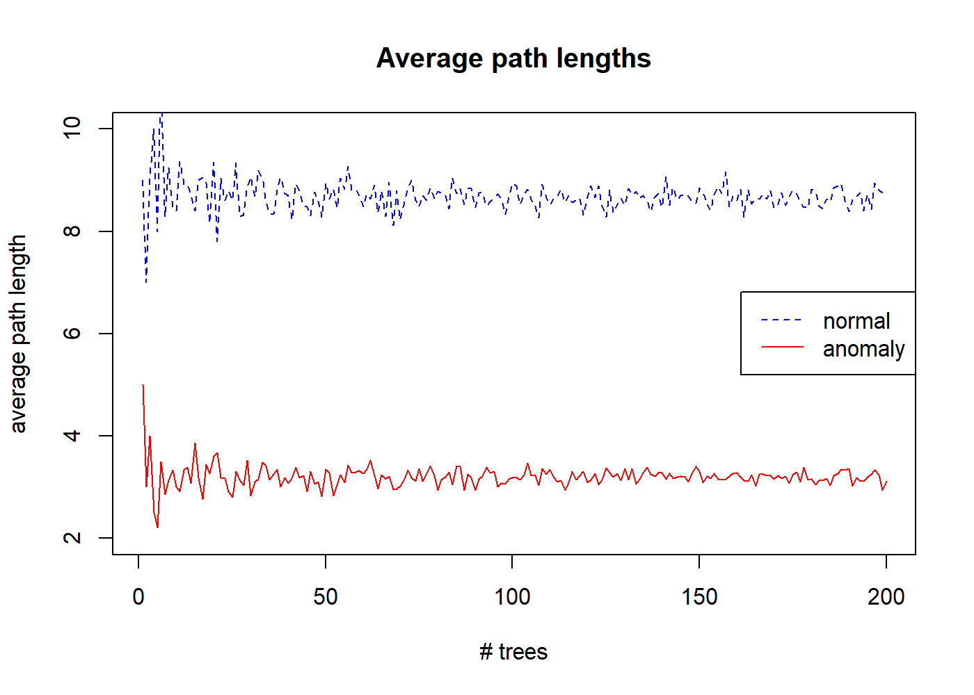
FIGURE 10.2: Average path lenghts for increasing number of trees.
After \(200\) trees, the average path length of the normal instance starts to converge to \(8.7\) and the path length of the anomalous one converges to \(3.1\). This shows that anomalies have shorter path lengths on average.
In practice, an Isolation Tree is recursively grown until a predefined maximum height is reached (more on this later), or when all instances are isolated, or all instances in a partition have the same values. Once all Isolation Trees in the ensemble (Isolation Forest) are generated, the instances can be sorted according to their average path length to the root. Then, instances with the shorter path lengths can be marked as anomalies.
Instead of directly using the average path lengths for deciding whether or not an instance is an anomaly, the authors of the method proposed an anomaly score that is between \(0\) and \(1\). The reason for this, is that this score is easier to interpret since it’s normalized. The closer the anomaly score is to \(1\) the more likely the instance is an anomaly. Instances with anomaly scores \(<< 0.5\) can be marked as normal. The anomaly score for an instance \(x\) is computed with the formula:
\[\begin{equation} s(x) = 2^{-\frac{E(h(x))}{c(n)}} \tag{10.1} \end{equation}\]
where \(h(x)\) is the path length of \(x\) to the root of a given tree and \(E(h(x))\) is the average of the path lengths of \(x\) across all trees in the ensemble. \(n\) is the number of instances in the train set. \(c(n)\) is the average path length of an unsuccessful search in a binary search tree:
\[\begin{equation} c(n) = 2H(n-1) - (2(n-1)/n) \tag{10.2} \end{equation}\]
where \(H(x)\) denotes the harmonic number and is estimated by \(ln(x) + 0.5772156649\) (Euler-Mascheroni constant).
A practical ‘trick’ that Isolation Forests use is sub-sampling without replacement. That is, instead of using the entire training set, an independent random sample of size \(p\) is used to build each tree. The sub-sampling reduces the swamping and masking effects. Swamping occurs when normal instances are too close to anomalies and thus, marked as anomalies. Masking refers to the presence of too many anomalies close together. This increases the number of partitions needed to isolate each anomaly point.
Figure 10.3 (left) shows a set of \(4000\) normal and \(100\) anomalous instances clustered in the same region. The right plot shows how it looks like after sampling \(256\) instances from the total. Here, we can see that the anomalous points are more clearly separated from the normal ones.
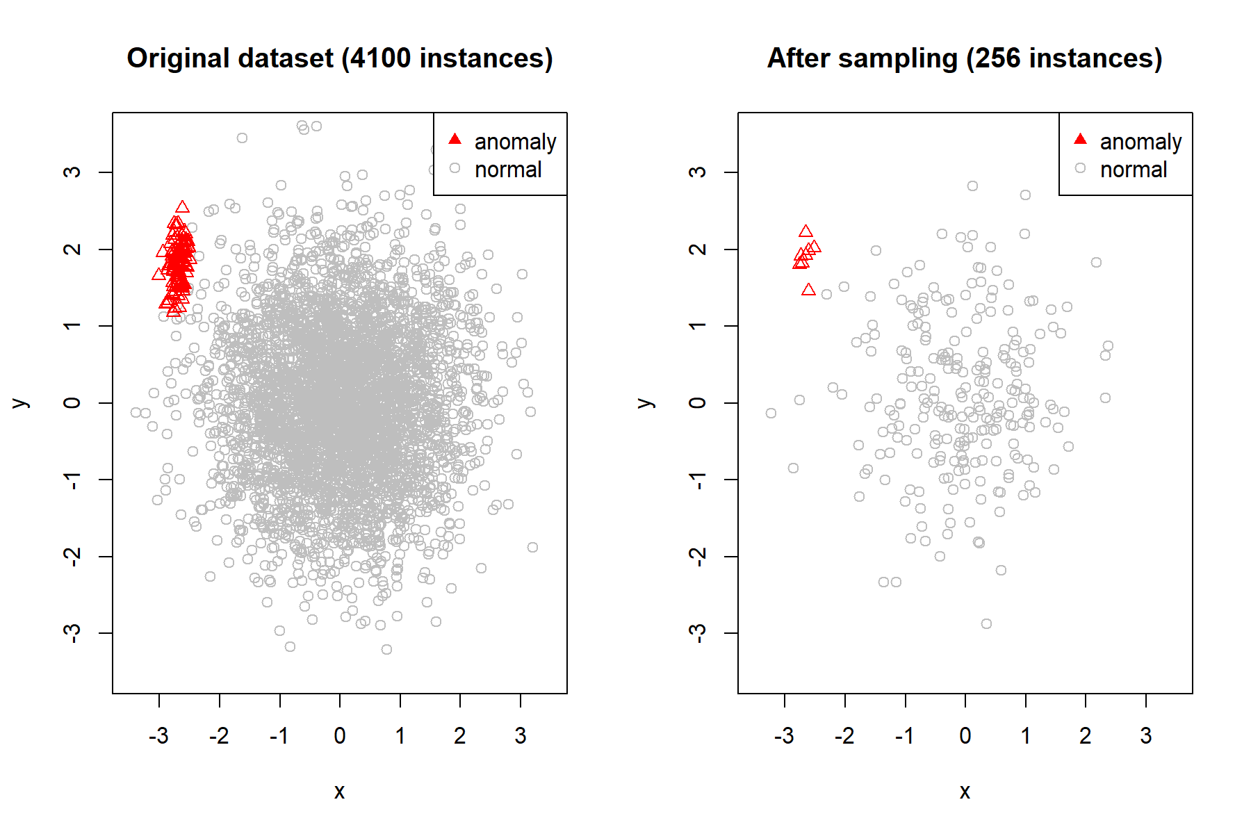
FIGURE 10.3: Dataset before and after sampling.
Previously, I mentioned that trees are grown until a predefined maximum height is reached. The authors of the method suggest to set this maximum height to \(l=ceiling(log_2(p))\) which approximates the average tree height. Remember that \(p\) is the sampling size. Since anomalous instances are closer to the root, we can expect normal instances to be in the lower sections of the tree, thus, there is no need to grow the entire tree and we can limit its height.
The only two parameters of the algorithm are the number of trees and the sampling size \(p\). The authors recommend a default sampling size of \(256\) and \(100\) trees.
At training time, the ensemble of trees is generated using the train data. It is not necessary that the train data contain examples of anomalous instances. This is advantageous because in many cases the anomalous instances are scarce so we can reserve them for testing. At test time, instances in the test set are passed through all trees and an anomaly score is computed for each. Instances with an anomaly score greater than some threshold are marked as anomalies. The optimal threshold can be estimated using an Area Under the Curve analysis which will be covered in the following sections.
The solitude R package (Srikanth 2020) provides convenient functions to train Isolation Forests and make predictions. In the following section we will use it to detect abnormal fish behaviors.
10.2 Detecting Abnormal Fish Behaviors
visualize_fish.R extract_features.R isolation_forest_fish.R
In marine biology, the analysis of fish behavior is essential since it can be used to detect environmental changes produced by pollution, climate change, etc. Fish behaviors can be characterized by their trajectories, that is, how they move within the environment. A trajectory is the path that an object follows through space and time.
Capturing fish trajectories is a challenging task specially, in unconstrained underwater conditions. Thankfully, the Fish4Knowledge28 project has developed fish analysis tools and methods to ease the task. They have processed enormous amounts of video streaming data and have extracted fish information including trajectories. They have made the fish trajectories dataset publicly available29 (Beyan and Fisher 2013).
The FISH TRAJECTORIES dataset contains \(3102\) trajectories belonging to the Dascyllus reticulatus fish (see Figure 10.4) observed in the Taiwanese coral reef. Each trajectory is labeled as ‘normal’ or ‘abnormal’. The trajectories were extracted from underwater video and stored as coordinates over time.
![Example of Dascyllus reticulatus fish. (Author: Rickard Zerpe. Source: wikimedia.org (CC BY 2.0) [https://creativecommons.org/licenses/by/2.0/legalcode]).](images/dascyllus_reticulatus.jpg)
FIGURE 10.4: Example of Dascyllus reticulatus fish. (Author: Rickard Zerpe. Source: wikimedia.org (CC BY 2.0) [https://creativecommons.org/licenses/by/2.0/legalcode]).
Our main task will be to detect the abnormal trajectories using an Isolation Forest but before that, we are going to explore, visualize, and pre-process the dataset.
10.2.1 Exploring and Visualizing Trajectories
The data is stored in a .mat file, so we are going to use the package R.matlab (Bengtsson 2018) to import the data into an array. The following code can be found in the script visualize_fish.R.
library(R.matlab)

# Read data.
df <- readMat("../fishDetections_total3102.mat"))$fish.detections

# Print data frame dimensions.
dim(df)
#> [1]    7    1 3102
We use the dim() function to print the dimensions of the array. From the output, we can see that there are \(3102\) individual trajectories and each trajectory has \(7\) attributes. Let’s explore what are the contents of a single trajectory. The following code snippet extracts the first trajectory and prints its structure.
# Read one of the trajectories.
trj <- df[,,1]

# Inspect its structure.
str(trj)
#> List of 7
#> $ frame.number    : num [1:37, 1] 826 827 828 829 833 834 835 836 ...
#> $ bounding.box.x  : num [1:37, 1] 167 165 162 159 125 124 126 126 ...
#> $ bounding.box.y  : num [1:37, 1] 67 65 65 66 58 61 65 71 71 62 ...
#> $ bounding.box.w  : num [1:37, 1] 40 37 39 34 39 39 38 38 37 31 ...
#> $ bounding.box.h  : num [1:37, 1] 38 40 40 38 35 34 34 33 34 35 ...
#> $ class           : num [1, 1] 1
#> $ classDescription: chr [1, 1] "normal"
A trajectory is composed of \(7\) pieces of information:
- frame.number: Frame number in original video.
- bounding.box.x: Bounding box leftmost edge.
- bounding.box.y: Bounding box topmost edge.
- bounding.box.w: Bounding box width.
- bounding.box.h: Bounding box height.
- class: 1=normal, 2=rare.
- classDescription: ‘normal’ or abnormal’.
The bounding box represents the square region where the fish was detected in the video footage. Figure 10.5 shows an example of a fish and its bounding box (not from the original dataset but for illustration purpose only). Also note that the dataset does not contain the images but only the bounding boxes’ coordinates.
![Fish bounding box (in red). (Author: Nick Hobgood. Source: wikimedia.org (CC BY-SA 3.0) [https://creativecommons.org/licenses/by-sa/3.0/legalcode]).](images/bounding_box.png)
FIGURE 10.5: Fish bounding box (in red). (Author: Nick Hobgood. Source: wikimedia.org (CC BY-SA 3.0) [https://creativecommons.org/licenses/by-sa/3.0/legalcode]).
Each trajectory has a different number of video frames. We can get the frame count by inspecting the length of one of the coordinates.
The first trajectory has \(37\) frames but on average, they have \(10\) frames. For our analyses, we only include trajectories with a minimum of \(10\) frames since it may be difficult to extract patterns from shorter paths. Furthermore, we are not going to use the bounding boxes themselves but the center point of the box.
At this point, it would be a good idea to plot how the data looks like. To do so, I will use the anipaths package (Scharf 2020) which has a function to animate trajectories! I will not cover the details here on how to use the package but the complete code is in the same script visualize_fish.R. The output result is in the form of an ‘index.html’ file that contains the interactive animation. For simplicity, I only selected \(50\) and \(10\) normal and abnormal trajectories (respectively) to be plotted. Figure 10.6 shows the resulting plot. The plot also includes some controls to play, pause, change the speed of the animation, etc.
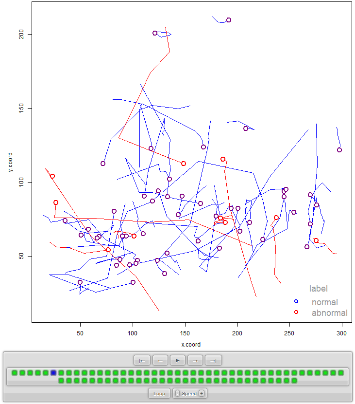
FIGURE 10.6: Example of animated trajectories generated with the anipaths package.
The ‘normal’ and ‘abnormal’ labels were determined by visual inspection by experts. The abnormal cases include events such as predator avoidance and aggressive movements (due to another fish or because of being frightened).
10.2.2 Preprocessing and Feature Extraction
Now that we have explored and visualized the data, we can begin with the preprocessing and feature extraction. As previously mentioned, the database contains bounding boxes and we want to use the center of the boxes to define the trajectories. The following code snippet (from extract_features.R) shows how the center of a box can be computed.
# Compute center of bounding box.
x.coord <- trj$bounding.box.x + (trj$bounding.box.w / 2)
y.coord <- trj$bounding.box.y + (trj$bounding.box.h / 2)

# Make times start at 0.
times <- trj$frame.number - trj$frame.number[1]
tmp <- data.frame(x.coord, y.coord, time=times)
The x and y coordinates of the center points from a given trajectory trj for all time frames will be stored in x.coord and y.coord. The next line ‘shifts’ the frame numbers so they all start in \(0\) (to simplify preprocessing). Finally we store the coordinates and frame times in a temporal data frame for further preprocessing.
At this point we will use the trajr package (McLean and Volponi 2018) which includes functions to plot and perform operations on trajectories. The TrajFromCoords() function can be used to create a trajectory object from a data frame. Note that the data frame needs to have a predefined order. That is why we first stored the x coordinates, then the y coordinates, and finally the time in the tmp data frame.
The temporal data frame is passed as the first argument and the frames per second is set to \(1\). Now we plot the tmp.trj object.
plot(tmp.trj, lwd = 1, xlab="x", ylab="y")
points(tmp.trj, draw.start.pt = T, pch = 1, col = "blue", cex = 1.2)
legend("topright", c("Starting point"), pch = c(16), col=c("black"))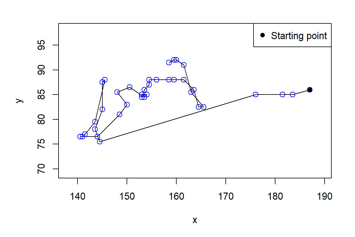
FIGURE 10.7: Plot of first trajectory.
From Figure 10.7 we can see that there are big time gaps between some points. This is because some time frames are missing. If we print the first rows of the trajectory and look at the time, we see that for example, time steps \(4,5,\) and \(6\) are missing.
head(tmp.trj)
#>        x    y time displacementTime       polar displacement
#> 1  187.0 86.0    0                0 187.0+86.0i     0.0+0.0i
#> 2  183.5 85.0    1                1 183.5+85.0i    -3.5-1.0i
#> 3  181.5 85.0    2                2 181.5+85.0i    -2.0+0.0i
#> 4  176.0 85.0    3                3 176.0+85.0i    -5.5+0.0i
#> 5  144.5 75.5    7                7 144.5+75.5i   -31.5-9.5i
Before continuing, it would be a good idea to try to fill those gaps. The function TrajResampleTime() does exactly that by applying linear interpolation along the trajectory.
If we plot the resampled trajectory (Figure 10.8) we will see how the missing points were filled.
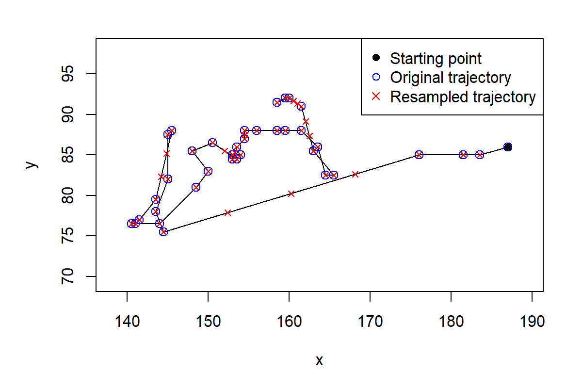
FIGURE 10.8: The original trajectory (circles) and after filling the gaps with linear interpolation (crosses).
Now we are almost ready to start detecting anomalies. Remember that Isolation Trees work with features by making partitions. Thus, we need to convert the trajectories into a feature vector representation. To do that, we will extract some features from the trajectories based on speed and acceleration. The TrajDerivatives() function computes the speed and linear acceleration between pairs of trajectory points.
derivs <- TrajDerivatives(resampled)

# Print first speeds.
head(derivs$speed)
#> [1] 3.640055 2.000000 5.500000 8.225342 8.225342 8.225342

# Print first linear accelerations.
head(derivs$acceleration)
#> [1] -1.640055  3.500000  2.725342  0.000000  0.000000  0.000000
The number of resulting speeds and accelerations are \(n-1\) and \(n-2\), respectively where \(n\) is the number of time steps in the trajectory. When training an Isolation Forest, all feature vectors need to be of the same length however, the trajectories in the database have different number of time steps. In order to have fixed-length feature vectors we will compute the mean, standard deviation, min, and max from both, the speeds and accelerations. Thus, we will end up having \(8\) features per trajectory. Finally we assemble the features into a data frame along with the trajectory id and the label (‘normal’ or ‘abnormal’).
  f.meanSpeed <- mean(derivs$speed)
  f.sdSpeed <- sd(derivs$speed)
  f.minSpeed <- min(derivs$speed)
  f.maxSpeed <- max(derivs$speed)

  f.meanAcc <- mean(derivs$acceleration)
  f.sdAcc <- sd(derivs$acceleration)
  f.minAcc <- min(derivs$acceleration)
  f.maxAcc <- max(derivs$acceleration)

  features <- data.frame(id=paste0("id",i), label=trj$classDescription[1],
                         f.meanSpeed, f.sdSpeed, f.minSpeed, f.maxSpeed,
                         f.meanAcc, f.sdAcc, f.minAcc, f.maxAcc)
We do the feature extraction for each trajectory and save the results as a .csv file fishFeatures.csv which is already included in the dataset. Let’s read and print the first rows of the dataset.
# Read dataset.
dataset <- read.csv("fishFeatures.csv", stringsAsFactors = T)

# Print first rows of the dataset.
head(dataset)
#>    id  label f.meanSpeed f.sdSpeed f.minSpeed f.maxSpeed   f.meanAcc
#> 1 id1 normal    2.623236  2.228456  0.5000000   8.225342 -0.05366002
#> 2 id2 normal    5.984859  3.820270  1.4142136  15.101738 -0.03870468
#> 3 id3 normal   16.608716 14.502042  0.7071068  46.424670 -1.00019597
#> 4 id5 normal    4.808608  4.137387  0.5000000  17.204651 -0.28181520
#> 5 id6 normal   17.785747  9.926729  3.3541020  44.240818 -0.53753380
#> 6 id7 normal    9.848422  6.026229  0.0000000  33.324165 -0.10555561
#> f.sdAcc   f.minAcc  f.maxAcc
#> 1  1.839475  -5.532760  3.500000
#> 2  2.660073  -7.273932  7.058594
#> 3 12.890386 -24.320298 30.714624
#> 4  5.228209 -12.204651 15.623512
#> 5 11.272472 -22.178067 21.768613
#> 6  6.692688 -31.262613 11.683561
Each row represents one trajectory. We can use the table() function to get the counts for ‘normal’ and ‘abnormal’ cases.
After discarding trajectories with less than \(10\) points we ended up with \(1093\) ‘normal’ instances and \(54\) ‘abnormal’ instances.
10.2.3 Training the Model
To get a preliminary idea of how difficult it is to separate the two classes we can use a MDS plot (see chapter 4) to project the \(8\) features into a \(2\)-dimensional plane.
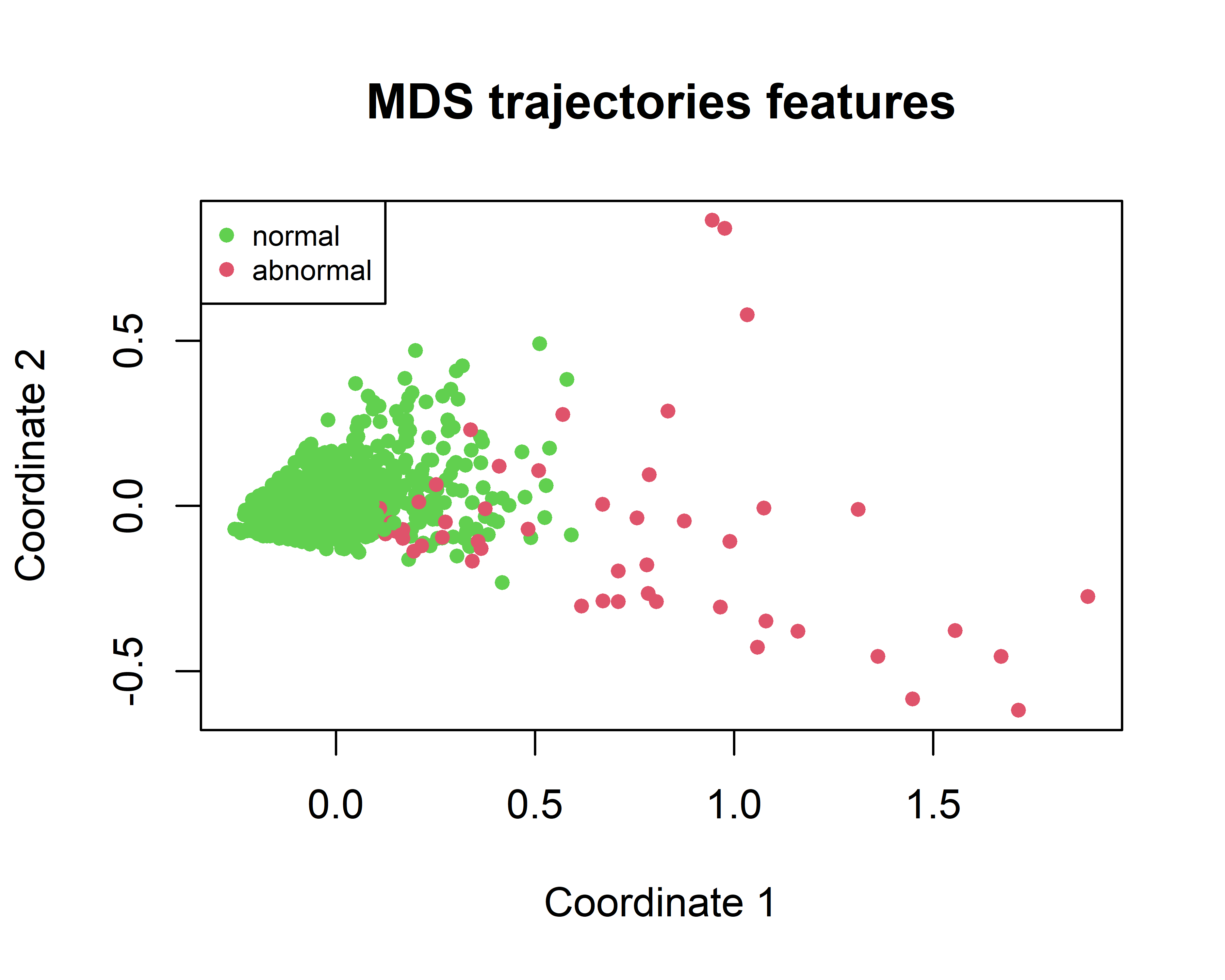
FIGURE 10.9: MDS of the fish trajectories.
In Figure 10.9 we see that several abnormal points are in the right hand side but many others are in the same space as the normal points so it’s time to train an Isolation Forest and see to what extent it can detect the abnormal cases!
One of the nice things about Isolation Forest is that it does not need examples of the abnormal cases during training. If we want, we can also include the abnormal cases but since we don’t have many we will reserve them for the test set. The script isolation_forest_fish.R contains the code to train the model. We will split the data into a train set (\(80\%\)) consisting only of normal instances and a test set with both, normal and abnormal instances. The train set is stored in the data frame train.normal and the test set in test.all. Since the method is based on trees, we don’t need to normalize the data.
First, we need to define the parameters of the Isolation Forest. We can do so by passing the values at creation time.
As suggested in the original paper (Liu, Ting, and Zhou 2008), the sampling size is set to \(256\) and the number of trees to \(100\). The nproc parameter specifies the number of CPU cores to use. I set it to \(1\) to ensure we get reproducible results.
Now we can train the model with the train set. The first two columns are removed since they correspond to the trajectories ids and class label.
Once the model is trained, we can start making predictions. Let’s start by making predictions on the train set (later we’ll do it on the test set). We know that the train set only consists of normal instances.
The returned value of the predict() function is a data frame containing the average tree depth and the anomaly score for each instance.
# Print first rows of predictions.
head(train.scores)

#>    id average_depth anomaly_score
#> 1:  1          7.97     0.5831917
#> 2:  2          8.00     0.5820092
#> 3:  3          7.98     0.5827973
#> 4:  4          7.80     0.5899383
#> 5:  5          7.77     0.5911370
#> 6:  6          7.90     0.5859603
We know that the train set only has normal instances thus, we need to find the highest anomaly score so that we can set a threshold to detect the abnormal cases. The following code will print the highest anomaly scores.
# Sort and display instances with the highest anomaly scores.
head(train.scores[order(anomaly_score, decreasing = TRUE)])

#>     id average_depth anomaly_score
#> 1:  75          4.05     0.7603188
#> 2: 618          4.45     0.7400179
#> 3: 147          4.67     0.7290844
#> 4: 661          4.75     0.7251487
#> 5: 756          4.80     0.7226998
#> 6:  54          5.54     0.6874070
The highest anomaly score for a normal instance is \(0.7603\) so we would assume that abnormal points will have higher anomaly scores. Armed with this information, we set the threshold to \(0.7603\) and instances having a higher anomaly score will be considered to be abnormal.
Now, we predict the anomaly scores on the test set and if the score is \(> threshold\) then we classify that point as abnormal. The predicted.labels array will contain \(0s\) and \(1s\). A \(1\) means that the instance is abnormal.
# Predict anomaly scores on test set.
test.scores <- m.iforest$predict(test.all[,-c(1:2)])

# Predict labels based on threshold.
predicted.labels <- as.integer((test.scores$anomaly_score > threshold))
Now that we have the predicted labels we can compute some performance metrics.
# All abnormal cases are at the end so we can
# compute the ground truth as follows.
gt.all <- c(rep(0,nrow(test.normal)), rep(1, nrow(test.abnormal)))
levels <- c("0","1")

# Compute performance metrics.
cm <- confusionMatrix(factor(predicted.labels, levels = levels),
                      factor(gt.all, levels = levels),
                      positive = "1")

# Print confusion matrix.
cm$table

#>           Reference
#> Prediction   0   1
#>          0 218  37
#>          1   0  17

# Print sensitivity
cm$byClass["Sensitivity"]

#> Sensitivity
#>   0.3148148
From the confusion matrix we see that \(17\) out of \(54\) abnormal instances were detected. On the other hand, all the normal instances (\(218\)) were correctly identified as such. The sensitivity (also known as recall) of the abnormal class was \(17/54=0.314\) which seems very low. We are failing to detect several of the abnormal cases.
One thing we can do is to decrease the threshold at the expense of increasing the false positives, that is, classifying normal instances as abnormal. If we set threshold <- 0.6 we get the following confusion matrix.
This time we were able to identify \(46\) of the abnormal cases! This gives a sensitivity of \(46/54=0.85\) which is much better than before. However, nothing is for free. If we look at the normal class, this time we had \(12\) misclassified points (false positives).
In this example we manually tried different thresholds and evaluated their impact on the final results. In the following section I will show you a method that allows you to estimate the performance of a model when considering many possible thresholds at once!
10.2.4 ROC Curve and AUC
The receiver operating characteristic curve, also known as ROC curve is a plot that depicts how the sensitivity and the false positive rate (FPR) behave as the detection threshold varies. The sensitivity/recall can be calculated by dividing the true positives by the total number of positives \(TP/P\) (see chapter 2). The \(FPR=FP/N\) where FP are the false positives and N are the total number of negative examples (the normal trajectories). The FPR is also known as the probability of false alarm. Ideally, we want a model that has a high sensitivity and a low FPR.
In R we can use the PRROC package (Grau, Grosse, and Keilwagen 2015) to plot ROC curves. The ROC curve of the Isolation Forest results for the abnormal fish trajectory detection can be plotted using the following code:
library(PRROC)
roc_obj <- roc.curve(scores.class0 = test.scores$anomaly_score,
                     weights.class0 = gt.all,
                     curve = TRUE,
                     rand.compute = TRUE)

# Set rand.plot = TRUE to also plot the random model's curve.
plot(roc_obj, rand.plot = TRUE)
The argument scores.class0 specifies the returned scores by the Isolation Forest and weights.class0 are the true labels, \(1\) for the positive class (abnormal), and \(0\) for the negative class (normal). We set curve=TRUE so the method returns a table with thresholds and their respective sensitivity and FPR. The rand.compute=TRUE instructs the function to also compute the curve of a random model, that is, one that predicts scores at random. Figure 10.10 shows the ROC plot.
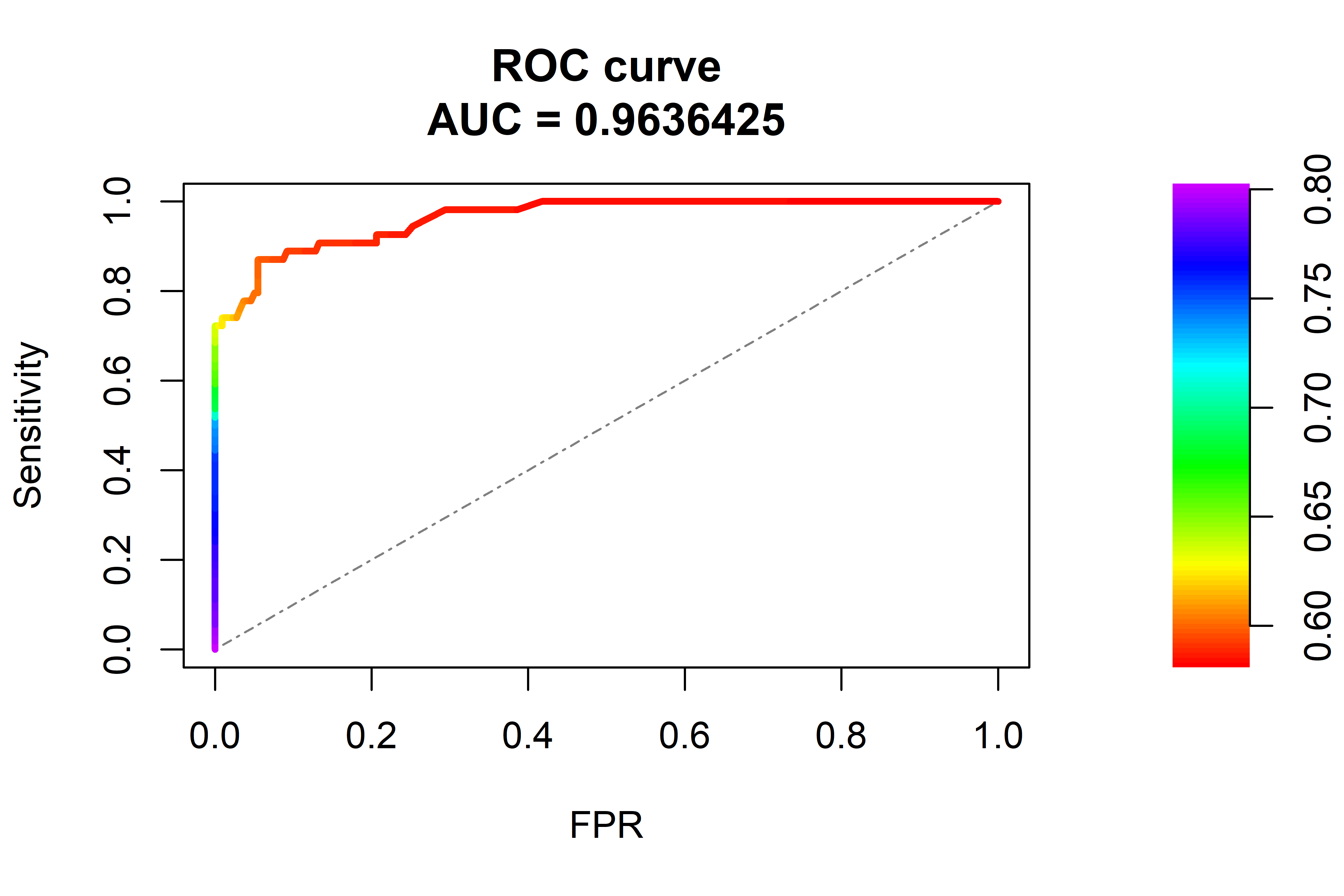
FIGURE 10.10: ROC curve and AUC. The dashed line represents a random model.
Here we can see how the sensitivity and FPR increase as the threshold decreases. In the best case we want a sensitivity of \(1\) and a FPR of \(0\). This ideal point is located at top left corner but this model does not reach that level of performance but a bit lower. The dashed line in the diagonal is the curve for a random model. We can also access the thresholds table:
# Print first values of the curve table.
roc_obj$curve

#>      [,1]       [,2]      [,3]
#> [1,]    0 0.00000000 0.8015213
#> [2,]    0 0.01851852 0.7977342
#> [3,]    0 0.03703704 0.7939650
#> [4,]    0 0.05555556 0.7875449
#> [5,]    0 0.09259259 0.7864799
#>  .....
The first column is the FPR, the second column is the sensitivity, and the last column is the threshold. Choosing the best threshold is not straightforward and will depend on the compromise we want to have between sensitivity and FPR.
Note that the plot also prints an \(AUC=0.963\). This is known as the Area Under the Curve (AUC) and as the name implies, it is the area under the ROC curve. A perfect model will have an AUC of \(1.0\). Our model achieved an AUC of \(0.963\) which is pretty good. A random model will have an AUC around \(0.5\). A value below \(0.5\) means that the model is performing worse than random. The AUC is a performance metric that measures the quality of a model regardless of the selected threshold and is typically presented in addition to accuracy, recall, precision, etc.
10.3 Autoencoders
In its simplest form, an autoencoder is a neural network whose output layer has the same shape as the input layer. If you are not familiar with artificial neural networks, you can take a look at chapter 8. An autoencoder will try to learn how to generate an output that is as similar as possible to the provided input. Figure 10.11 shows an example of a simple autoencoder with \(4\) units in the input and output layers. The hidden layer has \(2\) units.
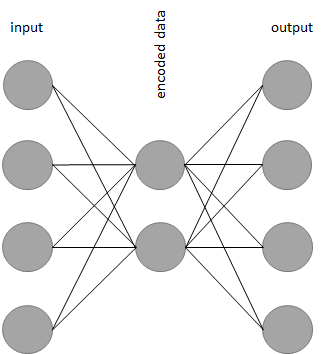
FIGURE 10.11: Example of a simple autoencoder.
Recall that when training a classification or regression model, we need to provide training examples of the form \((x,y)\) where \(x\) represents the input features and \(y\) is the desired output (a label or a number). When training an autoencoder, the input and the output is the same, that is, \((x,x)\).
Now you may be wondering what is the point of training a model that generates the same output as its input. If you take a closer look at Figure 10.11 you can see that the hidden layer has fewer units (only \(2\)) than the input and output layers. When the data is passed from the input layer to the hidden layer it is ‘reduced’ (compressed). Then, the compressed data is reconstructed as it is passed to the subsequent layers until it reaches the output. Thus, the neural network will learn to compress and reconstruct the data at the same time. Once the network is trained, we can get rid of the layers after the middle hidden layer and use the ‘left-hand-side’ of the network to compress our data. This left-hand-side is called the encoder. Then, we can use the right-hand-side to decompress the data. This part is called the decoder. In this example, the encoder and decoder consist of only \(1\) layer but they can have more (as we will see in the next section). In practice, you will not use autoencoders to compress files in your computer because there are more efficient methods to do that. Furthermore, the compression is lossy, that is, there is no guarantee that the reconstructed file will be exactly the same as the original. However, autoencoders have many applications including:
- Dimensionality reduction for visualization.
- Data denoising.
- Data generation (variational autoencoders).
- Anomaly detection (this is what we are interested in!).
Recall that when training a neural network we need to define a loss function. The loss function captures how well the network is learning. It measures how different the predictions are from the true expected outputs. In the context of autoencoders, this difference is known as the reconstruction error and can be measured using the mean squared error (similar to regression).
10.3.1 Autoencoders for Anomaly Detection
keras_autoencoder_fish.R
Autoencoders can be used as anomaly detectors. This idea will be demonstrated with an example to detect abnormal fish trajectories. The way this is done is by training an autoencoder to compress and reconstruct the normal instances. Once the autoencoder has learned to encode normal instances, we can expect the reconstruction error to be small. When presented with out-of-the-normal instances, the autoencoder will have a hard time trying to reconstruct them and consequently, the reconstruction error will be high. Similar to Isolation Forests where the tree path length provides a measure of the rarity of an instance, the reconstruction error in autoencoders can be used as an anomaly score.
To tell whether an instance is abnormal or not, we pass it through the autoencoder and compute its reconstruction error \(\epsilon\). If \(\epsilon > threshold\) the input data can be regarded as abnormal.
Similar to what we did with the Isolation Forest, we will use the fishFeatures.csv file that contains the fish trajectories encoded as feature vectors. Each trajectory is composed of \(8\) numeric features based on acceleration and speed. We will use \(80\%\) of the normal instances to train the autoencoder. All abnormal instances will be used for the test set.
After splitting the data (the code is in keras_autoencoder_fish.R), we will normalize (standardize) it. The normalize.standard() function will normalize the data such that it has a mean of \(0\) and a standard deviation of \(1\) using the following formula:
\[\begin{equation} z_i = \frac{x_i - \mu}{\sigma} \tag{10.3} \end{equation}\]
where \(\mu\) is the mean and \(\sigma\) is the standard deviation of \(x\). This is slightly different from the \(0\)-\(1\) normalization we have used before. The reason is that when scaling to \(0\)-\(1\) the min and max values from the train set need to be learned. If there are data points in the test set that have values outside the min and max they will be truncated. But since we expect anomalies to have rare values, it is likely that they will be outside the train set ranges and will be truncated. After being truncated, abnormal instances could now look more similar to the normal ones thus, it will be more difficult to spot them. By standardizing the data we make sure that the extreme values of the abnormal points are preserved. In this case, the parameters to be learned from the train set are \(\mu\) and \(\sigma\).
Once the data is normalized we can define the autoencoder in keras as follows:
autoencoder <- keras_model_sequential()

autoencoder %>%
  layer_dense(units = 32, activation = 'relu',
              input_shape = ncol(train.normal)-2) %>%
  layer_dense(units = 16, activation = 'relu') %>%
  layer_dense(units = 8, activation = 'relu') %>%
  layer_dense(units = 16, activation = 'relu') %>%
  layer_dense(units = 32, activation = 'relu') %>%
  layer_dense(units = ncol(train.normal)-2, activation = 'linear')
This is a normal neural network with an input layer having the same number of units as number of features (\(8\)). This network has \(5\) hidden layers of size \(32,16,8,16\), and \(32\), respectively. The output layer has \(8\) units (the same as the input layer). All activation functions are RELU’s except the last one which is linear because the network should be able to produce any number as output. Now we can compile and fit the model.
autoencoder %>% compile(
  loss = 'mse',
  optimizer = optimizer_sgd(lr = 0.01),
  metrics = c('mse')
)

history <- autoencoder %>% fit(
  as.matrix(train.normal[,-c(1:2)]),
  as.matrix(train.normal[,-c(1:2)]),
  epochs = 100,
  batch_size = 32,
  validation_split = 0.10,
  verbose = 2,
  view_metrics = TRUE
)
We set mean squared error (MSE) as the loss function. We use the normal instances in the train set (train.normal) as the input and expected output. The validation split is set to \(10\%\) so we can plot the reconstruction error (loss) on unseen instances. Finally, the model is trained for \(100\) epochs. From Figure 10.12 we can see that as the training progresses, the loss and the MSE decrease.
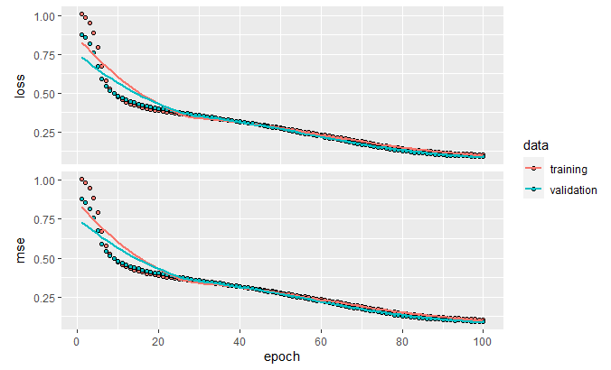
FIGURE 10.12: Loss and MSE.
We can now compute the MSE on the normal and abnormal test sets. The test.normal data frame only contains normal test instances and test.abnormal only contains abnormal test instances.
# Compute MSE on normal test set.
autoencoder %>% evaluate(as.matrix(test.normal[,-c(1:2)]),
                         as.matrix(test.normal[,-c(1:2)]))
#>        loss mean_squared_error
#>  0.06147528         0.06147528

# Compute MSE on abnormal test set.
autoencoder %>% evaluate(as.matrix(test.abnormal[,-c(1:2)]),
                         as.matrix(test.abnormal[,-c(1:2)]))
#>       loss mean_squared_error
#>   2.660597           2.660597
Clearly, the MSE of the normal test set is much lower than the abnormal test set. This means that the autoencoder had a difficult time trying to reconstruct the abnormal points because it never saw similar ones before.
To find a good threshold we can start by analyzing the reconstruction errors on the train set. First, we need to get the predictions.
# Predict values on the normal train set.
preds.train.normal <- autoencoder %>%
  predict_on_batch(as.matrix(train.normal[,-c(1:2)]))
The variable preds.train.normal contains the predicted values for each feature and each instance. We can use those predictions to compute the reconstruction error by comparing them with the ground truth values. As reconstruction error we will use the squared errors. The function squared.errors() computes the reconstruction error for each instance.
# Compute individual squared errors in train set.
errors.train.normal <- squared.errors(preds.train.normal,
                                   as.matrix(train.normal[,-c(1:2)]))

mean(errors.train.normal)
#> [1] 0.8113273

quantile(errors.train.normal)
#>         0%        25%        50%        75%       100%
#>  0.0158690  0.2926631  0.4978471  0.8874694 15.0958992
The mean reconstruction error of the normal instances in the train set is \(0.811\). If we look at the quantiles, we can see that most of the instances have an error of \(<= 0.887\). With this information we can set threshold <- 1.0. If the reconstruction error is \(> threshold\) then we will consider that point as an anomaly.
# Make predictions on the abnormal test set.
preds.test.abnormal <- autoencoder %>%
  predict_on_batch(as.matrix(test.abnormal[,-c(1:2)]))

# Compute reconstruction errors.
errors.test.abnormal <- squared.errors(preds.test.abnormal,
                                       as.matrix(test.abnormal[,-c(1:2)]))

# Predict labels based on threshold 1:abnormal, 0:normal.
pred.labels.abnormal <- as.integer((errors.test.abnormal > threshold))

# Count how many abnormal instances were detected.
sum(pred.labels.abnormal)
#> [1] 46
By using that threshold the autoencoder was able to detect \(46\) out of the \(54\) anomaly points. From the following confusion matrix we can also see that there were \(16\) false positives.
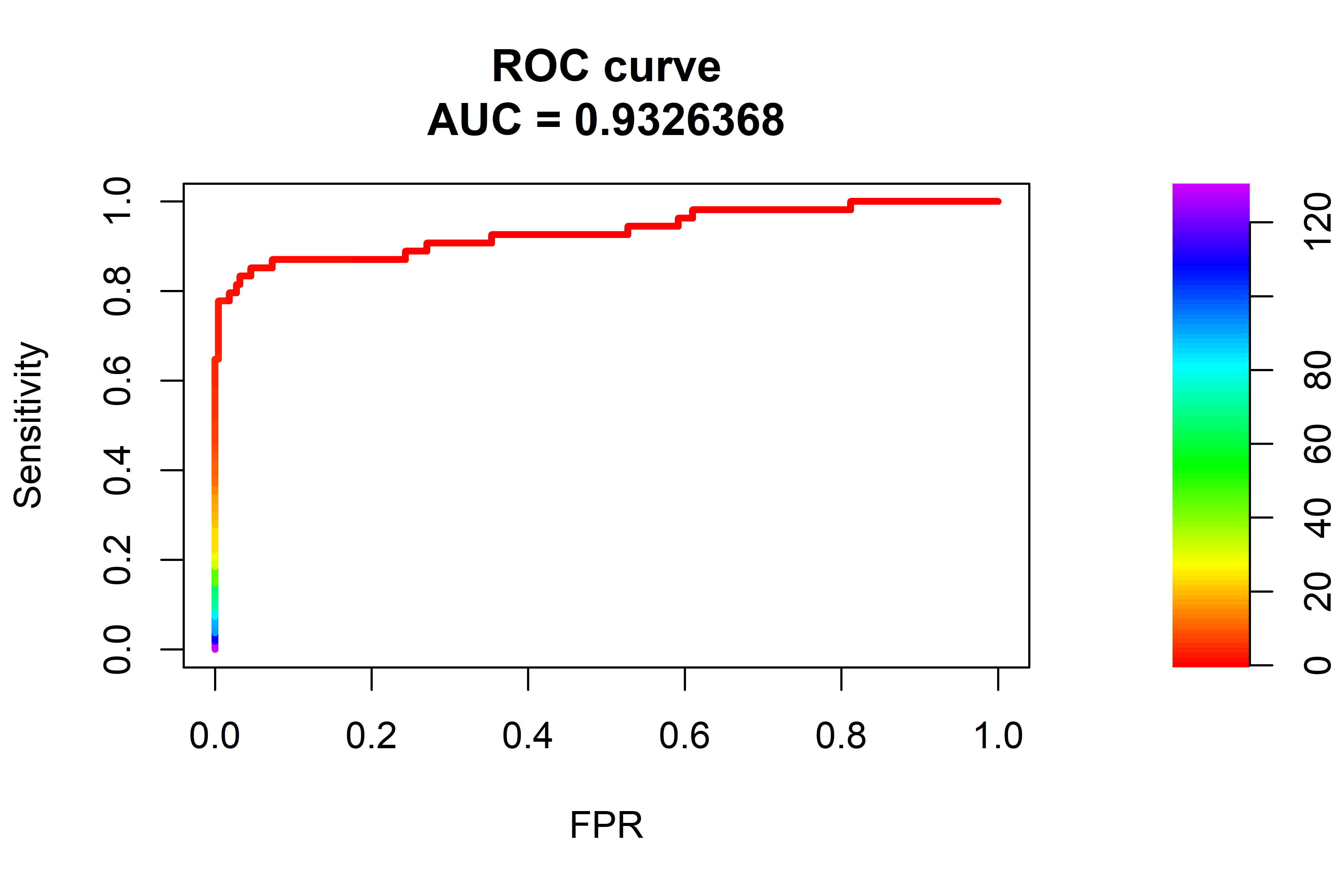
FIGURE 10.13: ROC curve and AUC. The dashed line represents a random model.
From the ROC curve in Figure 10.13 we can see that the AUC was \(0.93\) which is lower than the \(0.96\) achieved by the Isolation Forest but with some fine tuning and training for more epochs, the autoencoder should be able to achieve similar results.
10.4 Summary
This chapter presented two anomaly detection models, namely Isolation Forests and autoencoders. Examples of how those models can be used for anomaly trajectory detection were also presented. This chapter also introduced ROC curves and AUC which can be used to assess the performance of a model.
- Isolation Forests work by generating random partitions of the features until all instances are isolated.
- Abnormal points are more likely to be isolated during the first partitions.
- The average tree path length of abnormal points is smaller than that of normal points.
- An anomaly score that ranges between \(0\) and \(1\) is calculated based on the path length and the closer to \(1\) the more likely the point is an anomaly.
- A ROC curve is used to visualize the sensitivity and false positive rate of a model for different thresholds.
- The area under the curve AUC can be used to summarize the performance of a model.
- A simple autoencoder is an artificial neural network whose output layer has the same shape as the input layer.
- Autoencoders are used to encode the data into a lower dimension from which then, it can be reconstructed.
- The reconstruction error (loss) is a measure of how distant a prediction is from the ground truth and can be used as an anomaly score.